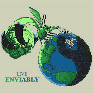
Today I finished another quick illustration for an online contest. This particular contest was a challenge for three main reasons. 1) I only had three partial days to design, create final sketch and then fully render final version. 2) I intended to use my new one month trial adobe illustrator and my new wacomb tablet to create the final vector art. I’ve never made a vector based illustration before, and I had only used adobe illustrator a couple of times to lay in some text on images, and I’ve only drawn with the wacomb tablet twice before. 3) The contest rules only allow for six colors including black and white and tints and tones of colors. I have never worked under color restrictions before and definitely not while working with a new medium. I gave myself this challenge because I need to learn the computer programs and I figure I may as well have a chance to win some income while practicing these new skills. You can see the finished version to the right. Please read on to see my process and thoughts as I designed and created this unique illustration. Then please go to http://www.greeneyed.com/contest_page.php?contest=1&entry=45 to vote on my design.
In brief. the contest is put on by a company called “Green Eyed Monster” and they are promoting a healthy environment. My task was to design a bag that would display this message visually and appeal to the common person.
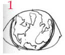
Any good illustration has to start with lots of planning and sketching of ideas. Unfortunately I didn’t have time to let my thoughts simmer day after day until I had developed a brilliant stew. Instead I ended up relying heavily on my previous illustrations to fill in the gaps. As seen below, I started with very basic concept sketch for a green eyed monster. I actually was thinking about skipping the contest all together because I found out about it too late. While watching a commercial I thought of the idea to have a green monster with one eye and there would be a globe with the continents where his eyeball should be.
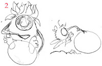
 This then developed into sketch two, a quick sketch of the monster sitting on the earth picking at the garbage and eating it. Sort of like cats scratch at fleas.
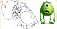
 Sketch three builds off an idea I used in a poster design for a masspirg earth day event. The idea here is that the monster is floating next to the earth and he is using a vacuum to suck up the garbage from the earth. At this point I decided to look up the phrase “green Eyed Monster” to see what sort of things might inspire my drawing. I use this technique when I start to run into walls with the sketches and need more reference. To my surprise I found this guy who was almost an exact replica of the monster I just designed. Yikes, back to the drawing board as they say.
 I like to keep my old paintings hanging in my studio to keep me motivated and remind me what finished products look like. I looked up and noticed how my honey pot ant painting resembled the vacuum bag on the monsters back. This gave me the idea to create a monster that would mimic honey pot ants, only this monster would gobble up and store garbage in his abdomen instead of honey. The last few sketches show the development of that character. You will also notice I had another ant painting depicting a specid wasp and this inspired the idea to add wings to the creature.
 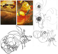 Once the character was more or less designed I went ahead and worked out which continent layout felt best and moved the stream of garbage around a bit. I now have an elephant nose sucking the garbage up. This of course comes from another sketch I have hanging in my studio.
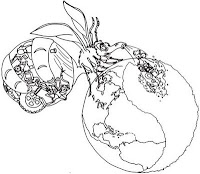 Now that I had the monster and his environment figured out I needed to figure out how to use Adobe illustrator to create vector art. I actually know the basic concept behind vector art because I took a digital illustration class three years ago. Unfortunately I ended up taking the digital illustration for animators class rather than the one for illustrators. So we spent the whole semester working with other programs and one day talking about illustrator. I basically spent a couple of hours trying to figure this out and realized I was trying to do the impossible in a short period of time. I ended up settling for an inked outline done in Adobe illustrator which I then brought into Photoshop where I did the color. Below you can see the difference between a magnified version of a vector (illustrator) drawing versus my original pencil drawing and pen drawing and the raster (Photoshop) image.
 Generally I will also do tons of color samples to determine the mood and overall feel of a piece. However I had pretty good idea of what I wanted for this image due to the theme and localized colors of objects. I wanted a green earth with black garbage, blue water, and a green monster. The yinyang pattern just sort of emerged from the sketches so I went with it. I also considered having an apple stem and leaves sticking out of the top of the earth but felt it was a bit much.
And now the final again.


