Saturday, March 21, 2009

Children's Illustration Process

My process mentioned below is quite long because good children’s book illustration should go beyond what the written word says and go into a further dimension ,adding to the story. Some illustrators just make an image depicting the exact words of the text, which is fine in some cases, but I find that my favorite books demonstrate a give and take relationship between the words on the page and the images.

There are two main categories of children’s books, the picture book or story book. In short, picture books are supported by the pictures and would make no sense without them. Story books are held together by the story and the illustrations serve in a somewhat subordinate role. Neither of these should be limited to what the story tells us.
A picture book may say something like, “The apple was huge” and the image may show the apple taller than buildings and perhaps show workers loading large dump trucks with pieces of apple. A story book may say something like “ The bright red apple was larger than any building in town and the workers had to work day an night to remove the apple before the big day”. While the image would need to communicate these things, it’s still a good idea to add to the image. Perhaps as complicated as adding a huge worm in the apple, snapping at the workers and making their jobs harder, or as simple as adding a small but noticeable worm on a sidewalk, slithering away in horror of how big the apple is.

Thumbnails- The very first art I do after talking to a client about there project is the initial idea thumbnail sketch. I also take lots of notes from the children’s story and from the client on what they would like to see in the illustration. The notes make it easy for me to refer to specific colors mentioned for the scene, specific characters and objects mentioned in the story etc. Most of the smaller elements may not be incorporated into the illustration until the next drawing stage, but it’s good to keep them in the back of your mind. This first image is extremely rough as you can see below.
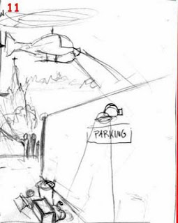

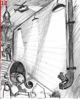
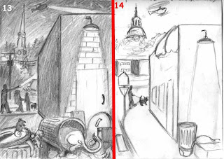
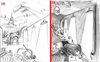
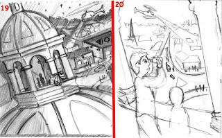
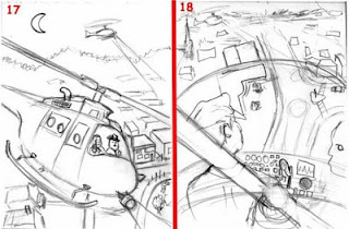
Then before doing any research I continue to make thumbnail sketches (smaller than a business card) , loosely putting my initial ideas on paper. This helps weed out the bad ideas and develop them into good ones. Generally clients have a very static idea in mind of how each image should look. That’s where it’s good to take notes on there thoughts, but then be sure to give them other unique and creative solutions that would work just as well or even better. This takes more time but it ensures you get fresh results instead of just the first idea that pops into your head. Generally the first idea you have isn’t necessarily the best or most unique. If you get stuck for ideas at this point try some of the tips from my post titled “Generating ideas and Inspiration.” Below you will see a few of the thumbnail sketches I did for my image “The Search for Rudy”. The clients asked for an image of Rudy sleeping behind a trash can in an alley, while kids and a helicopter are searching for him. In my thought process I figured it may be cool to have an image looking down on the town from the helicopter or a bell tower. This is also a good point to start drawing elements at different scales. You’ll notice the difference between the giraffe in 15 and 16. The clients loved these ideas but decided to stay with their original idea, so Rudy would be center stage.

Refined Sketch- Once they chose from about fifteen thumbnail sketches we go onto a more detailed sketch maybe two in which I include facial expressions, correct size relationships etc. when we narrow it down to one image I go into a much more detailed sketch. Sometimes I get reference photos before I even begin sketching the thumbnails but by the time I get to these final sketches I have to get even more references for the image.
References consist of googled images, movies, national Geographic’s, travel books, art books, figurines, textured fabrics, objects, nature etc. Take lots of photos, and use more than one model or more than one costume. In some cases I even make clay sculptures of characters, cardboard sculptures of buildings etc. to help get lighting right on the objects and to help draw characters in weird positions from any angle.

Value Sketch- Now I decide if I need to do a black and white shaded sketch or if I can go right to the color sketches. For this image I had a pretty good idea what the values should be and I did experiment a bit during the thumbnail stage. For the more complex images I almost always do a value sketch to make the color stage easier. Sometimes I do more than one of these for the client to choose from. I might have a sketch of a room interior and the shading will show if the room is lit or not among other things.
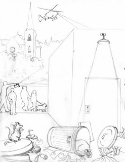


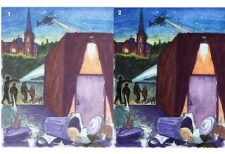
Color/Hue- Now that I have a final sketch that the client and I are happy with, I move on to color samples. The idea here is that you want to give yourself and the client a pretty good idea what the final overall color scheme will be. Don’t worry about the details at this point, you want to see what a purple shirt looks like up against the background colors, we don’t need to know the color of the buttons on the shirt. Experiment the same as you did with the thumbnail sketches. If you’re doing an illustration of a UFO it might be cool to have a greenish tint to a night sky rather than a dark blue or black. For one of my recent logo designs I did thirty color samples. For some tips and tricks with color check out my post titled color tips and tricks.
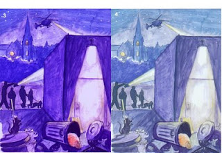
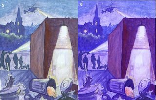
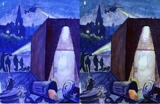
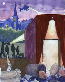


Once I have a refined sketch, a good value study, a good color sample and some photo reference to work from, I’m clear to go onto the final image. Generally I work on a pretty good size canvas around 18”x24”, so I usually use a projector to draw the final image onto the canvas. When I work with watercolor I usually work around 8”x11”, I find that sometimes it works nicely to print the drawing directly onto watercolor paper.



Generating Ideas and Inspiration

There are three things you must do in order to successfully generate ideas for your art.
1)consume plenty of ginkoboloba
2) stand on your head, count to ten while holding your breath and think happy thoughts.
3) Sit very still in a metal chair with a hat made of tin foil placed perfectly over the back of your skull.

If none of these work for you, continue reading.

In reality there are no sure fire ways to get great ideas. In a sense they come to you when you are ready to receive them and each person prepares themselves to receive ideas in different ways. Since I’m an artist I tend to think of things visually, so the methods I’ve mentioned below are mostly based on visual observation.

mind/idea web- Most people have used these before for writing papers and other projects. The basic idea is you write down a starting word, then build a web of related words around that word, then build off from each of those words as far as you can. This process often generates ideas you may not have otherwise thought of.

Observation- This method for me primarily refers to observation of nature. When you think about it most inventions are things observed from nature. We see a duck with webbed feet and think “those are cool, I’ll make me some” and we get scuba diving flippers, we see a bird flying and create airplanes etc. Artists have also observed nature to create some amazing and imaginative scenes. The more you study nature the easier it will be for you to create imaginative worlds and creatures and objects that look and feel real. Ask any concept artist where there ideas come from and they will most likely tell you that the ideas started from observation of natural and man made objects. Even if they could create a castle without any physical observation of castles then they will at least resort to there memory bank of images they’ve seen in the past.

Do something to it- This is a method that evolves over time. Take an object or a drawing and do something to it. Do something else to it. Do something else to it. This is the method I generally use to design characters until they look just right. Most people get locked into there original ideas without ever seeing if it could evolve into something better. Check out my blog titled “Graduate Pinball Painting” to see an example of a simple cartoon I developed into a larger concept for a painting.

Images- I often use tons of images to jog my mind into thinking of ideas. As a visual thinker, it helps me to see lots of other images to start mapping out ideas for my own images. Most of the ideas we have start somewhere, as creators it’s our job to find that place to start. I often start by looking through old copies of illustration directories. I’m pretty sure you can get a free copy by going here http://www.dirill.com/ It’s also helpful to look through magazines, travel books, books about the topic you’re illustrating ,whatever works to jog your mind into action. Some of my best ideas come while I’m watching TV.

The internet- Even if you don’t happen to have tons of reference images in the form of magazines and books laying around you can always go to the internet for ideas. Find a good artist forum like http://www.conceptart.org/ , http://www.wetcanvas.com/ , http://www.artwanted.com/, http://www.deviantart.com/, or for images on particular subjects check out stock photos on sites like http://www.morguefile.com/ , http://www.corbis.com/ , etc. if you’re looking for pictures of animals you can find zoo websites like http://whozoo.org/gallerymain.htm . These are meant to generate ideas and help you draw particular elements. Don’t just find some photo and copy it.
Other Artists- One of my favorite places to get ideas and inspiration is to look at my favorite artists websites and read their blogs. Below are just a handful of all those who have inspired me and my art.

James Gurney http://www.jamesgurney.com/ http://www.gurneyjourney.blogspot.com/
Dani Jones http://danidraws.com/
Richard Watson http://www.richardjessewatson.com/
Dan Dossantos http://www.dandossantos.com/home.html
Tony Diterlizzi http://www.diterlizzi.com/
Scott Burdick http://www.scottburdick.com/

Relax- Stop trying so hard. Just relax and get away from the project for while. You may spend hours racking your brain in the studio trying to come up with good ideas and get nothing. Some of my best ideas come when I’m in bed almost asleep or when I’m walking along the sidewalk or something mundane. This does tend to happen more often when I have thought about a particular project for a while already.

Friends- Let others help you think of ideas. I think all too often artists have the mentality that they have to come up with all of the ideas or it’s not really there art. Well that really depends on what you’re talking about I guess. I wouldn’t think it’s a great idea for someone to come up with every last detail in one of your images but it never hurts to ask for help and to accept someone’s ideas when they come up with something good. Just be careful of intellectual property. If you rely heavily on someone else’s idea, then make sure they are fine with it first and give them credit where it’s due. In actuality there is often more than one mind involved in illustrating any given image in a children’s book, as mentioned in my blog discussing the process of children’s book illustration. Most of the time an illustrator is working with their client and whoever else the client shows the sketches to as well as whoever pops there head into the studio. Many people have there own opinions and ideas so I would suggest tapping into that whenever possible. Sometimes and outsider can think more clearly than someone who’s been working with an illustration for weeks. As annoying as this can be at times, it can also be helpful.

For more on how to think of ideas check out http://www.princetonol.com/groups/iad/Files/ideas.htm

Color Tips and Tricks

-Use a computer program like Adobe photoshop to tile your image onto a page and print
off a bunch on an appropriate paper. This gives you a guideline to place colors onto.
- Determine your light and value. establish lighting and emphasis. What color are the light sources? (e.g. warm daylight or cool night light?) How does the light/shadows affect the local color of the objects in my painting? (e.g. colors are usually brighter and warmer in light, darker and cooler in shadow)
- Educate yourself on the basic qualities of color. know some basic terms (hue, saturation, value, etc.) and relationships (monochromatic, analogous, complementary, etc.).
-Limit your color palette. If your understanding of color is a bit fuzzy, try limiting your palette to one red, one yellow, and one Blue along with white and black. From these you should be able to mix most any color you need.
-limit the amount of black you use. Before reaching for a tube of black paint, experiment with your own mixed blacks. Try mixing a dark purple with a dark brown. I would also suggest you never use any color directly from the tube especially black and white. Everything in the real world is affected by the light in the environment around it. Right now I have two pieces of paper on my desktop. One is close to a window and the other is closer to the lamp light. The one near the window is bluish white while the one near the lamp is a yellowish white.


-Play with color temperature. Ask yourself if you want to use dominantly warm or cool colors? Most illustrations will be predominantly one or the other. In the image below I knew I wanted a dominant cool color scheme because it takes place at night. Most of the time I try to make the main character either a complimentary color to the background or have a high contrast between the character and the background to make him/her stick out more. While a brick building has an orange tinge during the day, I wanted it to be more towards a dark, cool reddish purple color at night with the exception of where it’s being hit by artificial light.

If you don’t have a color wheel, then either make one or buy one and learn the warm side and cool side of the wheel. Also warm colors like red can slowly turn cool with more cool color added. For example, add blue to red and you get purple, which is a cool color. Add only a bit of blue to red and you get a cool red. This can be helpful in creating atmospheric perspective in paintings. Below you will see two examples of the same image. One has a cooler and unsaturated earth red floor which recedes in space making it look further below, while the other image shows the floor in a warm saturated red making that part of the image come forward which distracts us from the focal point.


-play with saturation. Most children’s book illustration is pretty high on the saturation scale because kids love bright bold colors. If you’re going for a more sophisticated look you may wish to use less saturated color in your image.