Teh next one is from a more recent chapter book I illustrated called "Samantha Loses the Box Turtle"
Friday, August 17, 2012
IF:Teacher
This weeks Illustration friday topic is "teacher". So I've decided to post two images from a different books. The first is from "The Little Boy Without a Name and Without A Birthday"
Tuesday, August 7, 2012
Taste The Rainbow!
This past week I was at the Laundromat keeping my fiancé company when the vending machine called my name in no uncertain terms and with a very distinct glow, faintly trickling past my right eye. I vigorously walked in the direction of the faint hummm and was encountered by these bizarre colored disks in a red package with large white letters. They were small, strange, hard and shinny with a large white letter on each of the disks as well. I once saw E.T. Eat a substance similar to these on TV., back when I still wore those umpa loompa jammies with the zipper down the front and slippers sewn onto each leg. Yet those were very different than these. I knew these couldn't belong to him because the letter on them was an "S" and not an "E" or a "T" . Confounded I dumped some out onto the table in front of us and was only slightly surprised to see them roll around and form themselves into a crop circle sort of pattern before my very eyes. I ate one and then another. They kept making their way from the bag, to my stomach with such ease but not without a good deal of chewing along the way. That was my favorite segment of the journey as each bunch, when chewed, would release an assortment of fruity flavors upon contact with my tongue.
I eventually realized the bag would soon disappear and no trace of the flattened spheres would remain as proof of my encounter. Of course saving some aside was out of the question as each subsequent sample called out in a distinct vocal pitch increasingly fine tuned to my inner longings for fruity substances. Thinking quickly on my feet . . . I got nothing. But then Barbie told me I should do a painting of them. And so after about fifteen minutes of moving the pieces around, looking through a viewfinder, I came up with the absolute best composition I could possibly muster under the circumstances. Then Barbie picked them all up and rolled them onto the table top, like a pro at a craps table in Vegas, and I painted them!
So it is without further ado my dear blog readers, facebook friends, fans (well it sounded good), and family members that I present to you this 5"x6" watercolor rendering as proof of the alleged encounter with Martian space disks. Take it or leave it as you please. It is my contention that these colored disks are in fact sent from Mars in an attempt to search out and gather information from among the most astute and learned of all humans (clearly their navigation software is a bit glitchy) on the planet earth in an attempt to learn our strengths and weaknesses, so that the whole of Martian kind might stand some small chance against us in the ensuing war over their home planet. You've been warned!
Monday, August 6, 2012
Vermont Oil Landscape Paintings: 2
Back in April of 2011 I posted a bunch of oil landscape paintings I did over the past few years. I've since sold most of those paintings but haven't had time to make more until now. I've been working on tons of small watercolor landscapes and this past Saturday I painted the first oil landscape that I've done in over a year. I decided to document the process a bit.
posts of my watercolor landscapes. first few , shows my pocharde box for plein air watercolor painting
This first image shows the final painting. Oil on 5"x6" wooden panel. I actually already painted this same scene twice in watercolor but have changed things with each image. the first one has a house int he background with hay bails in the field on the right and the corn had just begun to grow. The second image put a differetn house int he image and has corn growing more but focusus more ont eh patern of the various fields. Then for this image I intended to focus primarily ont eh foreground corn. Unfortunately I ran low on time and ended up rushign the corm more than intended.
posts of my watercolor landscapes. first few , shows my pocharde box for plein air watercolor painting
This first image shows the final painting. Oil on 5"x6" wooden panel. I actually already painted this same scene twice in watercolor but have changed things with each image. the first one has a house int he background with hay bails in the field on the right and the corn had just begun to grow. The second image put a differetn house int he image and has corn growing more but focusus more ont eh patern of the various fields. Then for this image I intended to focus primarily ont eh foreground corn. Unfortunately I ran low on time and ended up rushign the corm more than intended.
This next image shows the various items I bring with me when painting with oil in plein air. Some of these things are the same as used for my watercolor supplies. 1) fishing or picnic basket with hinge top. 2) orderless Mineral Spirits in a pickle jar to clean the brushes. 3) oil paint tubes. I tied to limit my pallet to make color choices much faster and for an easier accomplished color harmony. Basically I have a warm and cool yellow, blue and red with white and a purple. 4) refined linseed oil for thinning the paint. 5) duct tape to hold things down. 6) a small folding canvas chair with a cold pouch built in under the seat. 7) This is a book I bring out into the field with me from time to time as I'm still learning how to get better and faster with my landscapes. "Oil Painter's Solution Book : Landscapes: Over 100 Answers to Your Oil Painting Questions" by Elizabeth Tolley. 8) A durable metal easel the adjusts up taller and shorter with tilting bar which accepts various size canvases. 9) A hand sewn brush pouch my sister made for me. It has various width slots to slide the brush handles into and has a flap that folds over the top of the brushes, then I roll it up to keep all of the bristles in shape during transport. In this pic I have folded the corners around the easel legs and clipped the corners of the brush pouch cloth in the back. 10) a mixture of OMS and linseed oil in a small glass jar with a tight lid for thinning paints. As I build up the layers I use less OMS and more linseed oil for thicker layers of paint that will take slightly longer to dry. Doing the reverse may lead to cracking paint. 11) this is the same wooden box I use for my watercolors. It has a hinging lid and various compartments in the bottom half. 12) paint rag. 13) wooden panel with gessoed surface. 14) my wooden paint pallet that I've had since college.
below is a pic showing the painting in process. 1) is a tiny quick thumbnail value study to help me remember the original value structure as the light changes a lot over the course of a few hours. 2) I put some duct tape from the top lid of the box to the bottom lid to keep it at a 90 degree angle. 3) I have a small piece of duct tape holding the panel to the wooden box lid. The wooden box is clamped onto the easel between the two clips made for holding canvas. You can see my pallet in the foreground with dabs of paint laid out. I generally hold it in my left hand or rest it on my lap.
Below is a series of pics I took during the painting process. The first step involves laying in basic value structure . This is very thinned down paint and generally helps the next layers of paint go down much faster. Sometimes I do the under painting with a warm raw sienna or ochre as I've read about many times but this time I decided to try something I read in Tolley's book which shows her painting the background values with a cooler under painting and the foreground with warmer tones. Doing this step also helps me to keep value in mind as I paint the various pieces of landscape. From reading Brad Teare's blog I learned a lot about keeping track of values from one mass to the next. Typically the sky will be the lightest value in the whole image, the ground or things on the horizontal plane facing the sky tend to be the next lightest while vertical things like trees and buildings have the darkest areas with the absolute darkest darks typically in the foreground. Typically i leave the sky white at this stage to allow more vibrancy to show through the sky. The darkest darks and highlights are saved for last
In this second image I have laid in the three or four main colors I mixed for the sky. I make a dark blue, light blue, a light yellow and light crimson. I start with dabs of each color, more blue and darker dabs towards the top and more of the warmer and lighter dabs towards the bottom of the sky. In step three I lightly blends the dabs of color together being sure to keep leave some of the colors showing rather than ruthlessly blend them. I learned this technique from a book by Wendon Blake called " The complete Painting Course"
The sky colors blended with a soft bristle brush. I use a flat brush but they say a filbert is best. I've never found a filbert that doesn't leave marks. Guess I haven't spent a enough money on them.
I've laid in a purplish undertone for the ridgeline trees then put a light blueish green for the highlights and tried to vary the colors slightly and focused on having an interesting ridgeline. I later went back in and put sky holes in the trees. Sky holes is when you can see sky through the foliage of the trees. I first learned about this from my highschool art teacher Larry Golden and have since learned it from James gurney, Wendon Blake, Brad teare and others. When I was first learning to paint with acrylics I used to paint the whole sky first and paint the tree and leaves on top but this method of painting the sky holes on top of the foliage I find to leave much more pleasant results. I'll probably write a whole blog post about it at some point.
Now I worked in the middle ground trees and continue with the foreground field trying to keep variation of color amongst the trees and have them slightly darker than the background while the foreground field was in fact slightly lighter than the background field. The final image shows the corn painted in. ( the first image show in this post.).
Labels:
how to,
landscape paintings,
nature,
process
Friday, August 3, 2012
Illustration Friday : Bounce
It's been a while since I've entered an illustration into the illustration friday but I had the perfect image for this weeks topic. The topic is "Bounce" so of course I had to enter this spread from my book "Allegra, Friend of All Monsters".
Monday, July 30, 2012
Thankfull for All of My Clients
Sooo excited to receive ten copies of "Samantha Loses the Box Turtle" in the mail today! It's been available for digtal e-readers for about a year now but I had always hoped it would one day make it to the printed page. Thanks to our successful kickstarter campaign this book is now available in print. The picture below shows the books spread out with one of them opened up to one of the internal illustrations, there are a couple of bookmarks and some amazing stickers as well that the author sent to me !!! Sooo Awesome! In the upper part of the photo are a couple of the near finish illustrations for the children's book I'm currently working on " Pigs Under The Post Office" .
I was pleasantly surprised to turn one of the shipping boxes over and find this great little message. It's a stick figure drawing of Samantha and says " what Samantha would look like without you" . 
I'm sooo blessed to work with such amazing clients who value what I do enough to hire me and who care enough to go that extra step. I've had a client who published my process work into a book just so I could show future clients my process and how much work goes into each project. I have a client who has gone the extra mile to publish his own books and continues to help me publish books for my other clients and who did book readings, fall festivals and even did some plein air painting with me and set up a number of other successfull book projects for me with new clients. I've had clients who send along bonus payments when they get the final art, love it and realize how many hours it actually took to complete the way they wanted it. I've had a client who got me my own studio for free at an old convent, paid for an apartment for me for a few months to finish their book (on top of regular payment for the illustrations), took me out on his boat to go fishing in Boston, brought me home cooked meals in the studio, invited me to use their pool any time I wanted, moved me back to Vermont from Boston with a company truck etc. I've had repeat clients who keep me in business. I had a client who liked to call every now and then just to talk about faith and life as friends. My clients have sent me copies of our books, send me amazing encouraging e-mails when I'm feeling stressed, they are respectful to me and generous.
I try my best to be professional but at times it's difficult working for soo many different people over the course of the years and it can be overwhelming when I promise to have things done by a certain time and then take on too much other work to follow through. My clients are patient and understanding. I have no idea where I would be without them!!!
So getting these books from Daisy and this fantastic little drawing and note just hit a chord with me. It made me realize that too often I focus on the few clients who never seem to make their payments on time, or who pull out of a project without paying for the work already done or who just keep wanting more and more without offering more pay. It made me realize I would rather just focus on the great clients who follow through on their end of things. They may feel like they can't do the illustrations without me but I know for sure I can't do these illustrations without them!! I'm particularly thankful for those clients like Daisy who have experience with teaching kids and who devote their lives to loving on kids. These are the clients who write great stories that kids will love and that will teach kids. In the end that's the real reason I'm in this business. Sure a large part of it is that I'm still just a kid at heart and I love to be able to bring that out in my illustrations but I could paint all day and not feel fullfilled unless it were for the books being published and making into the hands of kids.
Friday, July 13, 2012
One Week With an Illustrator in The Studio
This week is one of those rare weeks where I get to feel the joy of finishing off a few projects and packaging them up to send out to clients. Sooooo Happy!!! Most of my projects stretch on for months on end so whenever I finish a project it is a mixture of relief, excitement, exhaustion, and paranoia that they will come back for yet another revision on something. It's often like building a skyscraper with an indeterminate number of floors.
I began the week with some more color and border samples for "Pigs Under the Post Office"
I started this week on a high from having finished the final art for "Samantha hatches the Chicken Egg". One of the full page illustrations below.
I began the week with some more color and border samples for "Pigs Under the Post Office"
Continued with some e-mail correspondence with a repeat client with whom I will be starting another imaginative family portrait. I posted images to my artwanted.com portfolio, filled out my application for the East Burke Fall Folliage Festival, read art blogs, listened to art related podcasts, and talked to the graphic designer for my "A Cloudy Day " book. That book is finally going to print!!!!
I then found out that a book I illustrated the cover for in 2010 has finally been published! So I sent a congratulatory postcard along to that client.
I was finally able to make some time to do the absolute final revisions for the Bull Illustrations. I also got to use my "new" printers full 13"x19" printing capabilities for the first time : ) $82 for the ink and photo paper!
Then I had half a day to work on the final line drawing for my wedding invitations I'm doing the illustrations for. As much as I would like to show the progress for that, I really want to keep it a surprise for now but will definitely unveil that eventually.
The second half of the day I took the time to do an original watercolor painting of the turtle from "Samantha Loses the Box Turtle" which is a commissioned reward for the kickstarter campaign. Complete with a certificate of authenticity and free postcard samples of my art to go along with all of the other cool prizes they received from the author.
I started this week on a high from having finished the final art for "Samantha hatches the Chicken Egg". One of the full page illustrations below.
Today and tomorrow I will be finishing off the week by mailing/delivering the art, writing this blog post, probably updating my website and blog with my two new books available, "Samantha Loses the Box Turtle" paperback version and" "Hello Jesus, it's Jeanne... Again". Then I will transfer the final drawings for my pig book onto the final painting surface to prepare for a full week of painting next week!
Saturday, June 30, 2012
Cobblestone Magazine Two
This past week I recieved my two complimentary copies of the second cobblestone magazine I've done illustrations for!!! It's the July/august 2012 issue. The entire issue is about Frederick Law Olmsted and is mostly depicted with photos. I'm soo happy with how these final printed versions are coming out!
Thursday, June 28, 2012
Pocharde Box for Plein Air Watercolor Painting
It's been a while since my last post as I realized this post will be my one hundreth POST!!!! I found it to be a bit intimidating to approach this post as I didn't want to just keep posting recent art. I've been wanting to find the time to post informational and interesting posts. There is sooo much I have learned over the years to make my process faster, easier, and just with making art in general that I would like to share with others. Unfortunately those kinds of posts take a lot more preparation and effort. One day I suppose I will get to some of my ideas for those.
For today I decided to show a bit of behind the scenes for my materials I take with me when doing plein air watercolor paintings. In the past I've done alla prima oil paintings which would be a completely different, heavier more complex set up than this. At some point I will likely do a post on that process. When painting in oil I plan on taking the whole day to hike out into a field and stay set up for atleast a few hours. The light changes a lot over that time, so sometimes I end up going back a few times if needed.
Above is a picture of all my supplies in the general setup I use while painting. In this case I was sitting on the ground so I used my larger wicker paint box which I believe was a fishing basket I picked up cheap at a yardsale.
For today I decided to show a bit of behind the scenes for my materials I take with me when doing plein air watercolor paintings. In the past I've done alla prima oil paintings which would be a completely different, heavier more complex set up than this. At some point I will likely do a post on that process. When painting in oil I plan on taking the whole day to hike out into a field and stay set up for atleast a few hours. The light changes a lot over that time, so sometimes I end up going back a few times if needed.
Above is a picture of all my supplies in the general setup I use while painting. In this case I was sitting on the ground so I used my larger wicker paint box which I believe was a fishing basket I picked up cheap at a yardsale.
Generally I paint while sitting on a tree stump, rock, or chair etc. in which case I tend to use the smaller paint box (#2) which sits on my lap. 3) sometimes I tape the paper to the back of a watercolor paper pad which can be proped up inside the wicker basket. Other times I tape the paper to the upper inside cover of the #2 box. 4) I generally bring extra water so I can have clean paint water whenever needed. 5) Is a small set of watercolors which has four little mixing areas in the lid and a convenient thumb bracket on the base. 6) I generally bring my camera as most of the watercolors I do are with the intention of possibly turning them into larger oil paintings later in the studio. Taking pics will help me to get extra information that may be needed for that process. 7) masking tape holds the paper down so it doesn't curl or buckle while painting. 8) a pencil sharpener. 9) pencil to sketch out the image before starting to paint. 10) I find that those little chicken bullion cube containers work great for holding the paint water and the lid seems to be water tight from my experience. 11) a variety of brushes and scrap paper to test colors. I forgot to number the additional paint pallet I sometimes bring with me, shown in the pic. I also generally bring sunglasses which help me to see values easier. It's also to have a viewfinder cut into a pice of card stock which helps to frame the image. Lastly you'lle need paper towels to clean bushes in between colors.
The resulting painting for this particular outing is shown above. For me the interesting elements to this scene were the lines and shape of the landscape. I also tried to capture the warmth of the morning sun. As I was painting, a woman was walking her dog and stopped by for a short chat with my fiance and her dog. She saw me painting and it wasn't until she left that I found out she was the owner of this particular house.
A few more watercolors I've done over the past couple of weeks. I do enjoy doing these, but I also find this medium to be a bit frustrating at times as some things just need more time to do properly with watercolor.These same paintings with oil would have been probably four times longer to do though.
Labels:
landscape paintings,
nature,
process,
watercolor
Wednesday, May 30, 2012
A Cloudy Day: Part four
In progress illustrations
A change in sky color
As I'm in the process of writing up a newsletter I figured it's about time I put up the cover for my newest children's book "A cloudy Day" so I can link to it. This is just my own text layout as I don't have the final version of the cover available to me at this point. Finishing off the final two spot illustrations for this book tonight so it can head off to print soon!
A change in sky color
As I'm in the process of writing up a newsletter I figured it's about time I put up the cover for my newest children's book "A cloudy Day" so I can link to it. This is just my own text layout as I don't have the final version of the cover available to me at this point. Finishing off the final two spot illustrations for this book tonight so it can head off to print soon!
Samantha Cover : book Two : Part Three
part one : thumbnails and rough sketches
part two : Layout color choices
The sample below was my first draft of the cover on a grey scale layout. The author and I agreed that the background cupboards were too dark and her face was painted a bit too differently than the first book. So I adjusted those elements with guache as well as a few other tiny details.
Below I've posted the cover of the first book in the series. Which is currently available as an e-reader on Amazon.com and elsewhere. You can click ont he link on the left of this blog to buy the book on amazon.
part two : Layout color choices
I'm pretty sure I finished the cover for the second book in the samantha series today. Just in time to announce the kickstarter campaign for the first book. The goal is to be able to raise $500 to use towards costs associated with printing and promotion of "Samantha loses The Box Turtle" as a paperback book. It's currently only available as an e-reader and has done quit well with some requests for hard copies of the books. Check out the kickstarter campaign page to learn more! 16 days to go!http://www.kickstarter.com/projects/2016518480/samantha-loses-the-box-turtle
The cool thing about supporting the printing of this book through the kickstarter campaign is that no matter how little you donate, you will get goodies in return. At different donation levels you get prizes ranging from copies of the e-book, copies of the paperback book, stickers, an original piece of art by me!, or you can even have yourself or your kid written into the third book in the series! In many cases you would really just be donating the amount that it would typically cost to buy the book or e-book anyway.
Below I've posted the cover of the first book in the series. Which is currently available as an e-reader on Amazon.com and elsewhere. You can click ont he link on the left of this blog to buy the book on amazon.
Tuesday, May 29, 2012
Pond Watercolor Sketch
Over the past weekend I had a bit of time for a couple more small watercolor sketches. I'll probably be posting a few of these every so often. They are all are around 5"x6" and took about 15-30 min. In many cases I consciously simplify objects to favor having a finished sketch in my allotted time rather than a more detailed unfinished sketch.
Wednesday, May 23, 2012
Cover Layout Color Samples
It's time to chose the background layout color ! I've got fourteen options to start. Planning to get a general idea form these main options and then maybe tweak the color even more once the client sends me in a particular direction. I put the cover from the first book in the series at the bottom as a reference.
Samanth Cover Design: Book Two
Part one cover design process for first book in this series
Part two for cover design process of first book in this series
Today I finished off the rough draft of the final cover art for the second book in the "Samantha" Series authored by Daisy Griffin.
This was a hard cover to narrow down as I liked number twelve showing the glowing light coming from inside the incubator, most people polled seemed to like number nine which I also liked, we then started with number eight which the author liked. Really I would have been happy with about half of these concepts.
from here the author made More suggestions and we went into a more finished sketch.
Then color samples and into the final art seen at the top of this post.
Labels:
animals,
chapter book,
cover design,
watercolor
Monday, May 21, 2012
Watercolor Landscapes: North Hero Vermont
For more of my Vermont Landscapes got to : Oil Landscapes , Watercolor sketch
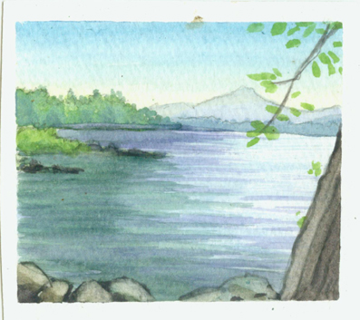
I spent the past weekend with my fiance at a friends camp in North hero Vermont, enjoying the summer. I found the time to squeeze in some small watercolor landscapes during my stay on the lake. I enjoyed it so much that I'm now considering spending a few days throughout the summer to make up a ton of these miniature landscapes all over vermont and make a zazzle store specially devoted to vermont postcards, calendars and the like. I still hope to work in atleast a few oil landscapes this summer to have in local businesses and will likely make that a priority, while doing these watercolor sketches when time is tight, perhaps some of them could become more finished oil paintings later.
Labels:
landscape paintings,
nature,
watercolor
Location:
North Hero, VT, USA
Wednesday, May 16, 2012
Pigs under the post office:one
Over the past month I've enjoyed finally putting in some quality time with my new children's book " Pigs Under the Post office". We've designed characters and narrowed down to the final thumbnails and I'm hoping to have the final drawings done by the end of the week.
I did a bunch of thumbnail sketches for each page of the book then the client and I chose the ones laid out below.
Labels:
character design,
children's book,
process,
sketch
Subscribe to:
Posts (Atom)