Showing posts with label concept art. Show all posts

Friday, October 8, 2010

Color and Composition Samples


WHile working on the color samples for a recent illustration I saw a couple of composition issues that were bugging me. The sword was going off the top edge of the canvas and almost touching the larger planet. This sort of thing creates a tension and draws attention to that area. I also don't like how the sword is basically pointing the viewers eyes right off the canvas. SO I made a couple of new composition samples posted below. The first oen still has an issue with the sword and the top edge fo the canvas and the second one just seems to have too much space. I like the closeness of the horizontal versions personally.
click on the images for larger views
Below are the colors samples. Basically I create these by printing the drawing onto thick 8"x11"paper and cover the print in liquitex matte gel medium. The gell keeps the paint from effecting the ink. Then I jump into painting my initial color ideas with acrylic paint. The first color sample takes anywhere from an hour to four hours depending on how complex the painting is. I think this image took two or three hours. Then I scan it into the computer.
Now I am free to change things in the sample working directly on top of the prvious sample. That way it only takes a few minutes to make small changes and scan again, I keep doing this until I feel I have exhausted the ideas I want ot try. By this point I have 5-10 samples. Now I go into photoshop and make duplicates of some to experiment even more by moving color sliders around and even saturation and contrast. Sometimes I might want to just effect the background so I make aduplicate and erase aroudn the foreground elements. I then throw this foreground over the background on the copy. Now I can select the foreground or background layer and make adjustments to each seperately. By this point I may have as many as twenty differnt samples but I begin to see some that I really don't like or that are just so similar to others that it would only be annoying to the clients trying to see the differences. SO I chose those that I feel need to be seen by the client and put them into one file like the one below, numbering each one.
Other posts on this image here and here


Imaginative Realism: How to Paint What Doesn't Exist

Wednesday, December 30, 2009

Reference for Cars

Today I find myself looking through tons of photos of cars trying to find the perfect match for my new book. After some time searching I discovered some great websites that actually sell cheap die cast models of cars. I know this tid bit of info will be extremely helpful later down the road with other projects and with this one. Typically I will be forced to work from photos for most everything I illustrate. Often for more complex objects and characters I have to make models in order to see how the light falls across forms. However I knew there would be no easy way to create my own model of a car from scratch so buying a diecast model should be the perfect solution. Mainly I want to share a couple of links for that as I'm sure others will eventually be faced with a simialr problem.

Secondly I didscovered some amazing diecast models of much older cars like this fire truck which would be a lot harder to go see in person. Buying a diecast could be the solution to doing historical paintings of rare cars. I could even see these older model cars being a great starting point or inspiration for creating futuristic car designs. The older cars have way more class and style than all the new stuff they are coming out with. One link to cheap die cast cars is http://www.diecastmodelswholesale.com/servlet/the-Fire-Engine-Diecast/Categories

there are plenty of websites I found that sell these sorts of things but this is one of the best I found so far. Secondly I found a great website with links to paper models of objects including things like cars, buildings, insects etc. One of the cooler ones I found was this hornet model. You can go on there and download the whole thing, cut it out and glue it together. The link, http://images.google.ca/imgres?imgurl=http://papermodels.files.wordpress.com/2009/09/suzuki-car-sx4-wrc.jpg&imgrefurl=http://papermodels.wordpress.com/category/cars-tractors-boxes-rally-f1/&usg=__FBp_c7hbp1c0KrwQO88au1a7oAk=&h=338&w=450&sz=59&hl=en&start=16&sig2=UeRo2r1ckeCUM3LnN46Lhw&um=1&tbnid=UEUboawEmWx_jM:&tbnh=95&tbnw=127&prev=/images%3Fq%3Dsuzuki%2Bmodel%2Bcar%26hl%3Den%26rlz%3D1T4GWYE_enUS345US345%26sa%3DN%26um%3D1&ei=H80aS4jWO47M8Qa8ueHlAw

Monday, May 25, 2009

Getting the Perfect Reference for Tricky Perspectives

If you've ever had to illustrate objects or people from weird angles for a client or otherwise then you should find today's post quit helpful. I actually recently came across this dilemma with a few of the children's illustrations I've been working on for my recent book. In one illustration I wanted a view of passengers getting ready to board the train but the perspective is from that of an ity bitty caterpillar in the hub of one of the trains wheels. So I needed to figure out how to get reference image of people from a perspective below street level. One obvious option is to have people lie down and try to get a picture from below them. the trouble with this is that their clothing will look wrong because the folds don't have gravity effecting them. A similar option would be to actually put yourself in that particular position and take a picture. If you're doing an illustration from above someones head looking down on them at strange perspective then just get up on something high and get someone to pose for you. Both of these will most likely give you trouble with the way the camera has translated the foreshortened limbs. There are a couple of other options I have enjoyed playing around with that don't include those wooden dolls you get at the art store.
For a while I have referenced a site called www.posemaniacs.com where you will find tons of poses of computer sculpted models . The best part about this site is that you can rotate around the poses to see them from all sorts of angles.


Another great option for models of people and other objects like cars, helicopters, building etc. can be found at www.3divia.com . This site is just amazing because once again you get to rotate around the poses and the objects. You have to do a quick download of there software but I've found it useful so far. I've only used the free models but I can just imagine how amazing the others must be judging from the free samples. How often do you really get the chance to rent a helicopter and take a photo of a house from above anyway? obviously you could spend hours looking for reference online but you won't get to choose the exact point of perspective you want unless you draw it all out, happen to know a drafting software or own a helicopter.


There is also the whole area of creating your own physical models out of clay, paper mache, wood, found objects etc. This works pretty good for very specific characters you've designed for a project. For example you may design an alien with all kinds of strange limbs so the best option most likely is to build your own model. For one of my books I got to do a bunch of illustrations of Noah's ark so I decided to take a few hours to actually build a small replica out of wood, shown below.


One final option I've used is called google sketchup which you can actually download for free and legally. This program allows you to build things from the ground up and then you can rotate around, under, above, zoom in and out etc. The trouble is that you will have to spend a bit of time figuring out the software but it's actually not too hard. I actually used this program to redesign my studio room. Now you could go all out and by the expensive programs but who really has the money for those?


Saturday, March 21, 2009

Generating Ideas and Inspiration

There are three things you must do in order to successfully generate ideas for your art.
1)consume plenty of ginkoboloba
2) stand on your head, count to ten while holding your breath and think happy thoughts.
3) Sit very still in a metal chair with a hat made of tin foil placed perfectly over the back of your skull.

If none of these work for you, continue reading.

In reality there are no sure fire ways to get great ideas. In a sense they come to you when you are ready to receive them and each person prepares themselves to receive ideas in different ways. Since I’m an artist I tend to think of things visually, so the methods I’ve mentioned below are mostly based on visual observation.

mind/idea web- Most people have used these before for writing papers and other projects. The basic idea is you write down a starting word, then build a web of related words around that word, then build off from each of those words as far as you can. This process often generates ideas you may not have otherwise thought of.

Observation- This method for me primarily refers to observation of nature. When you think about it most inventions are things observed from nature. We see a duck with webbed feet and think “those are cool, I’ll make me some” and we get scuba diving flippers, we see a bird flying and create airplanes etc. Artists have also observed nature to create some amazing and imaginative scenes. The more you study nature the easier it will be for you to create imaginative worlds and creatures and objects that look and feel real. Ask any concept artist where there ideas come from and they will most likely tell you that the ideas started from observation of natural and man made objects. Even if they could create a castle without any physical observation of castles then they will at least resort to there memory bank of images they’ve seen in the past.
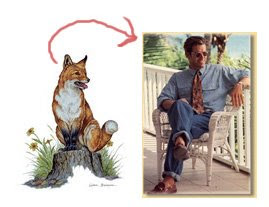
Do something to it- This is a method that evolves over time. Take an object or a drawing and do something to it. Do something else to it. Do something else to it. This is the method I generally use to design characters until they look just right. Most people get locked into there original ideas without ever seeing if it could evolve into something better. Check out my blog titled “Graduate Pinball Painting” to see an example of a simple cartoon I developed into a larger concept for a painting.

Images- I often use tons of images to jog my mind into thinking of ideas. As a visual thinker, it helps me to see lots of other images to start mapping out ideas for my own images. Most of the ideas we have start somewhere, as creators it’s our job to find that place to start. I often start by looking through old copies of illustration directories. I’m pretty sure you can get a free copy by going here http://www.dirill.com/ It’s also helpful to look through magazines, travel books, books about the topic you’re illustrating ,whatever works to jog your mind into action. Some of my best ideas come while I’m watching TV.

The internet- Even if you don’t happen to have tons of reference images in the form of magazines and books laying around you can always go to the internet for ideas. Find a good artist forum like http://www.conceptart.org/ , http://www.wetcanvas.com/ , http://www.artwanted.com/, http://www.deviantart.com/, or for images on particular subjects check out stock photos on sites like http://www.morguefile.com/ , http://www.corbis.com/ , etc. if you’re looking for pictures of animals you can find zoo websites like http://whozoo.org/gallerymain.htm . These are meant to generate ideas and help you draw particular elements. Don’t just find some photo and copy it.
Other Artists- One of my favorite places to get ideas and inspiration is to look at my favorite artists websites and read their blogs. Below are just a handful of all those who have inspired me and my art.

James Gurney http://www.jamesgurney.com/ http://www.gurneyjourney.blogspot.com/
Dani Jones http://danidraws.com/
Richard Watson http://www.richardjessewatson.com/
Dan Dossantos http://www.dandossantos.com/home.html
Tony Diterlizzi http://www.diterlizzi.com/
Scott Burdick http://www.scottburdick.com/

Relax- Stop trying so hard. Just relax and get away from the project for while. You may spend hours racking your brain in the studio trying to come up with good ideas and get nothing. Some of my best ideas come when I’m in bed almost asleep or when I’m walking along the sidewalk or something mundane. This does tend to happen more often when I have thought about a particular project for a while already.

Friends- Let others help you think of ideas. I think all too often artists have the mentality that they have to come up with all of the ideas or it’s not really there art. Well that really depends on what you’re talking about I guess. I wouldn’t think it’s a great idea for someone to come up with every last detail in one of your images but it never hurts to ask for help and to accept someone’s ideas when they come up with something good. Just be careful of intellectual property. If you rely heavily on someone else’s idea, then make sure they are fine with it first and give them credit where it’s due. In actuality there is often more than one mind involved in illustrating any given image in a children’s book, as mentioned in my blog discussing the process of children’s book illustration. Most of the time an illustrator is working with their client and whoever else the client shows the sketches to as well as whoever pops there head into the studio. Many people have there own opinions and ideas so I would suggest tapping into that whenever possible. Sometimes and outsider can think more clearly than someone who’s been working with an illustration for weeks. As annoying as this can be at times, it can also be helpful.

For more on how to think of ideas check out http://www.princetonol.com/groups/iad/Files/ideas.htm
Thursday, February 26, 2009

character designs

I thought maybe some of you would enjoy seeing the initial sketches for the characters I have designed for variouse projects over the past few years. A great book on character design is "Creating Characters with Personality" by. Tom Bancroft. Some of these are influences by the clients and others are influenced by other artists and objects. For example, some of these robots were inspired by a cd player I had.
This hippo character was my own design but the guidlines put forth that he had to be a hip hop hippo, a male, an adult figure, not necisarily dressed, kid friendly.

My initial Rudy sketches were my own design with very little input from the client. They needed an anthropomorphic saftey dog who loved donuts. These are a couple of the sketches I did. This is basically the first character I ever designed for a client. I used to draw stuff like this all the time in grade school, mostly aliens though.


Then with more guidance and sketches Rudy eventually evolved into this little guy. The clients were fairly specific about what they wanted but getting it right took tons of work.


Clara was a cartoon character but not quite as anthropomorphic as Rudy. She stay on all fours and talks to other animals. She does have a bit more facial expressions than a typical pug though.
This starfish actually took me a bit of time to develope as my original sketches were fairly stiff. Now he's one of the first things people comment on in the final images.


These are princesses from variouse lands of different times in history. It was a bit of a challenge for me to develope there costumes and facial features to make them easily recognizable as having a particular land of origin. They needed to be very distinct from one another and yet all have a sense of beauty about them.

And last are some seasonal characters I sketched for variouse projects. The witch was for a pumpkin carving design contest with "Pumkin Masters" which took second place in the faces category 2008. I don't typically draw characters that are meant to look evil. I have noticed in the past though that evil characters seem a lot easier to draw. I think it has to do with there imperfections. Sometimes when I draw children I have a hard time making there smiles look real. They often look angry. The Santa Clause is just a sketch I did for my sketch book. Maybe I'll develope him more next Christmas. I suppose I will probably go for more of a Saint Nicholas feel than a mere santa clause. The snowman was designed for a Christmas card. This character really humbled me because it was one of the first few I designed with no one elses ideas. I thought how hard could it be to draw a snowman? Really really hard. But for me it was mostly tough because I wanted to get an original feel. I also wanted him to have a spark of life to him. I tried variouse size snowballs, a pot for a hat, vest, variouse eyes, with and without ear muffs, etc. A detail as small as adding or leaving out eyebrows makes the biggest difference.

Monday, December 22, 2008

Illustration Process


Today I finished another quick illustration for an online contest. This particular contest was a challenge for three main reasons. 1) I only had three partial days to design, create final sketch and then fully render final version. 2) I intended to use my new one month trial adobe illustrator and my new wacomb tablet to create the final vector art. I’ve never made a vector based illustration before, and I had only used adobe illustrator a couple of times to lay in some text on images, and I’ve only drawn with the wacomb tablet twice before. 3) The contest rules only allow for six colors including black and white and tints and tones of colors. I have never worked under color restrictions before and definitely not while working with a new medium. I gave myself this challenge because I need to learn the computer programs and I figure I may as well have a chance to win some income while practicing these new skills. You can see the finished version to the right. Please read on to see my process and thoughts as I designed and created this unique illustration. Then please go to http://www.greeneyed.com/contest_page.php?contest=1&entry=45 to vote on my design.
In brief. the contest is put on by a company called “Green Eyed Monster” and they are promoting a healthy environment. My task was to design a bag that would display this message visually and appeal to the common person.
Any good illustration has to start with lots of planning and sketching of ideas. Unfortunately I didn’t have time to let my thoughts simmer day after day until I had developed a brilliant stew. Instead I ended up relying heavily on my previous illustrations to fill in the gaps. As seen below, I started with very basic concept sketch for a green eyed monster. I actually was thinking about skipping the contest all together because I found out about it too late. While watching a commercial I thought of the idea to have a green monster with one eye and there would be a globe with the continents where his eyeball should be.

This then developed into sketch two, a quick sketch of the monster sitting on the earth picking at the garbage and eating it. Sort of like cats scratch at fleas.
Sketch three builds off an idea I used in a poster design for a masspirg earth day event. The idea here is that the monster is floating next to the earth and he is using a vacuum to suck up the garbage from the earth. At this point I decided to look up the phrase “green Eyed Monster” to see what sort of things might inspire my drawing. I use this technique when I start to run into walls with the sketches and need more reference. To my surprise I found this guy who was almost an exact replica of the monster I just designed. Yikes, back to the drawing board as they say.
I like to keep my old paintings hanging in my studio to keep me motivated and remind me what finished products look like. I looked up and noticed how my honey pot ant painting resembled the vacuum bag on the monsters back. This gave me the idea to create a monster that would mimic honey pot ants, only this monster would gobble up and store garbage in his abdomen instead of honey. The last few sketches show the development of that character. You will also notice I had another ant painting depicting a specid wasp and this inspired the idea to add wings to the creature.
Once the character was more or less designed I went ahead and worked out which continent layout felt best and moved the stream of garbage around a bit. I now have an elephant nose sucking the garbage up. This of course comes from another sketch I have hanging in my studio.
Now that I had the monster and his environment figured out I needed to figure out how to use Adobe illustrator to create vector art. I actually know the basic concept behind vector art because I took a digital illustration class three years ago. Unfortunately I ended up taking the digital illustration for animators class rather than the one for illustrators. So we spent the whole semester working with other programs and one day talking about illustrator. I basically spent a couple of hours trying to figure this out and realized I was trying to do the impossible in a short period of time. I ended up settling for an inked outline done in Adobe illustrator which I then brought into Photoshop where I did the color. Below you can see the difference between a magnified version of a vector (illustrator) drawing versus my original pencil drawing and pen drawing and the raster (Photoshop) image.Generally I will also do tons of color samples to determine the mood and overall feel of a piece. However I had pretty good idea of what I wanted for this image due to the theme and localized colors of objects. I wanted a green earth with black garbage, blue water, and a green monster. The yinyang pattern just sort of emerged from the sketches so I went with it. I also considered having an apple stem and leaves sticking out of the top of the earth but felt it was a bit much.
And now the final again.