Showing posts with label nature. Show all posts

Monday, April 21, 2014

East Burke Vermont Winter Landscape Painting of Bure Mountain

I've been busy with a lot of different projects lately but was happy to be able to work in some time for an ala prima landscape painting this past week. It's the first acrylic painting I've done in a looong time but I tried to paint it like I would an oil, trying to lose the edges in some areas and having lots of colors worked into each  section. The painting is now available on my etsy store.
https://www.etsy.com/listing/186935865/original-east-burke-vermont-burke?ref=shop_home_active_1


Tuesday, August 27, 2013

Vermont Oil and Watercolor Landscape Paintings

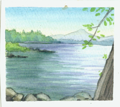
Each year I wait alllll   through the winter to finally have  a chance to go out and do some ala prima landscape paintings in the summer. The same was true of this year but unfortunately I never found a chance so far this summer to go out in the field and paint on location. A few weeks back i did finally take a bit of time to do a quick watercolor on location.
Then finally over the past couple of weeks i carved out some time from my current children's book to do a couple of oil landscape paintings of local vermont scenes. Both are done from photos though. The first is a barn in lyndonville vermont.
 I will have them for sale pretty much as soon as they dry and i can get  a frame on them. I'm not yet sure where i will have them for sale but considering local shops or the hospital, which displays local artists on their walls. This second one is from the top of Burke Mountain in East Burke Vermont looking out over Willoughby Gap and Willoughby Lake in Westmore Vermont. I've hiked Mnt. Hor, Mnt. Pisca and Blad Mnt. all visible in this image.

Tuesday, June 4, 2013

Frogzilla Digital Illustration Final

After a lot of reading and a few tutorials and some road blocks i finally have my first ever full page digital illustration about 95% done!!!  It took about twenty hours but most of that was just the learning curve and trying to be extra careful so I wouldn't accidentally lose lots of progress. I'm REALLY loving how quick and simple it is to make changes to color and or value. I'm hoping having digital under my belt will make my art more appealing to publishers as i plan to begin a  more vigorous marketing campaign.

I've come a loooong way since my very first digital sketch five years ago.


Monday, May 20, 2013

Maple Tree Watercolor Painting Kirby Vermont

   This past weekend I finally had the opportunity to get my watercolors out for my first ala prima landscape painting of the season! I have to give credit for the inspiration and idea for this piece to my wife.

 I'll likely eventually post this for sale on my etsy store but for now I'm going to get a few more paintings done first so i can photograph them and post them all at the same time. I currently have seventeen items posted to my etsy store, various landscape originals and prints.


A little bit of the process work.


Monday, August 6, 2012

Vermont Oil Landscape Paintings: 2

Back in April of 2011 I posted a bunch of oil landscape paintings I did over the past few years. I've since sold most of those paintings but haven't had time to make more until now. I've been working on tons of small watercolor landscapes and this past Saturday I painted the first oil landscape that I've done in over a year. I decided to document the process a bit.

posts of my watercolor landscapes. first few  , shows my pocharde box for plein air watercolor painting

This first image shows the final painting. Oil on 5"x6" wooden panel. I actually already painted this same scene twice in watercolor but have changed things with each image. the first one has  a house int he background with hay bails in the field on the right and the corn had just begun to grow. The second image put a differetn house int he image and has corn growing more but focusus more ont eh patern of the various fields. Then for this image I intended to focus primarily ont eh foreground corn. Unfortunately I ran low on time and ended up rushign the corm more than intended.

This next image shows the various items I bring with me when painting with oil in plein air. Some of these things are the same as used for my watercolor supplies. 1) fishing or picnic basket with hinge top. 2) orderless Mineral Spirits in a  pickle jar to clean the brushes. 3) oil paint tubes. I tied to limit my pallet to make color choices much faster and for an easier accomplished color harmony. Basically I have a warm and cool yellow, blue and red with white and a purple. 4) refined linseed oil for thinning the paint. 5) duct tape to hold things down. 6) a small folding canvas chair with a cold pouch built in under the seat. 7) This is a book I bring out into the field with me from time to time as I'm still learning how to get better and faster with my landscapes. "Oil Painter's Solution Book : Landscapes: Over 100 Answers to Your Oil Painting Questions" by Elizabeth Tolley. 8) A durable metal easel the adjusts up taller and shorter with tilting bar which accepts various size canvases. 9) A hand sewn brush pouch my sister made for me. It has various width slots to slide the brush handles into and has a flap that folds over the top of the brushes, then I roll it up to keep all of the bristles in shape during transport. In this pic I have folded the corners around the easel legs and clipped the corners of the brush pouch cloth in the back. 10) a mixture of OMS and linseed oil in a small glass jar with a  tight lid for thinning paints. As I build up the layers I use less OMS and more linseed oil for thicker layers of paint that will take slightly longer to dry. Doing the reverse may lead to cracking paint. 11) this is the same wooden box I use for my watercolors. It has a hinging lid and various compartments in the bottom half. 12) paint rag. 13) wooden panel with gessoed surface. 14) my wooden paint pallet that I've had since college.
below is a pic showing the painting in process. 1) is a tiny quick thumbnail value study to help me remember the original value structure as the light changes a lot over the course of a few hours. 2) I put some duct tape from the top lid of the box to the bottom lid to keep it at a 90 degree angle.  3) I have a small piece of duct tape holding the panel to the wooden box lid. The wooden box is clamped onto the easel between the two clips made for holding canvas. You can see my pallet in the foreground with dabs of paint laid out. I generally hold it in my left hand or rest it on my lap.

Below is a series of pics I took during the painting process. The first step involves laying in basic value structure . This is very thinned down paint and generally helps the next layers of paint go down much faster. Sometimes I do the under painting with a warm raw sienna or ochre as I've read about many times but this time I decided to try something I read in Tolley's book which shows her painting the background values with a cooler under painting and the foreground with warmer tones.  Doing this step also helps me to keep value in mind as I paint the various pieces of landscape. From reading Brad Teare's blog I learned a lot about keeping track of values from one mass to the next. Typically the sky will be the lightest value in the whole image, the ground or things on the horizontal plane facing the sky tend to be the next lightest while vertical things like trees and buildings have the darkest areas with the absolute darkest darks typically in the foreground. Typically i leave the sky white at this stage to allow more vibrancy to show through the sky. The darkest darks and highlights are saved for last

In this second image I have laid in the three or four main colors I mixed for the sky. I make a dark blue, light blue, a light yellow and light crimson. I start with dabs of each color, more blue and darker dabs towards the top and more of the warmer and lighter dabs towards the bottom of the sky. In step three I lightly blends the dabs of color together being sure to keep leave some of the colors showing rather than ruthlessly blend them. I learned this technique from a book by Wendon Blake called " The complete Painting Course" 
The sky colors blended with a soft bristle brush. I use a flat brush but they say a filbert is best. I've never found a filbert that doesn't leave marks. Guess I haven't spent a enough money on them.
I've laid in a purplish undertone for the ridgeline trees then put a light blueish green for the highlights and tried to vary the colors slightly and focused on having an interesting ridgeline. I later went back in and put sky holes in the trees. Sky holes is when you can see sky through the foliage of the trees. I first learned about this from my highschool art teacher Larry Golden and have since learned it from James gurney, Wendon Blake, Brad teare and others. When I was first learning to paint with acrylics I used to paint the whole sky first and paint the tree and leaves on top but this method of painting the sky holes on top of the foliage I find to leave much more pleasant results. I'll probably write a whole blog post about it at some point.
Now I worked in the middle ground trees and continue with the foreground field trying to keep variation of color amongst the trees and have them slightly darker than the background while the foreground field was in fact slightly lighter than the background field. The final image shows the corn painted in. ( the first image show in this post.).

Saturday, June 30, 2012

Cobblestone Magazine Two


This past week I recieved my two complimentary copies of the second cobblestone magazine I've done illustrations for!!! It's the July/august 2012 issue. The entire issue is about Frederick Law Olmsted and is mostly depicted with photos. I'm soo happy with how these final printed versions are coming out!

Thursday, June 28, 2012

Pocharde Box for Plein Air Watercolor Painting

It's been a while since my last post as I realized this post will be my one hundreth POST!!!! I found it to be a bit intimidating to approach this post as I didn't want to just keep posting recent art. I've been wanting to find the time to post informational and interesting posts. There is sooo much I have learned over the years to make my process faster, easier, and just with making art in general that I would like to share with others. Unfortunately those kinds of posts take a lot more preparation and effort. One day I suppose I will get to some of my ideas for those.
     For today I decided to show a bit of behind the scenes for my materials I take with me when doing plein air watercolor paintings. In the past I've done alla prima oil paintings which would be a completely different, heavier more complex set up than this. At some point I will likely do a post on that process. When painting in oil I plan on taking the whole day to hike out into a field and stay set up for atleast a few hours. The light changes a lot over that time, so sometimes I end up going back a few times if needed.


Above is a picture of all my supplies in the general setup I use while painting. In this case I was sitting on the ground so I used my larger wicker paint box which I believe was a fishing basket I picked up cheap at a yardsale.
Generally I paint while sitting on a  tree stump, rock, or chair etc. in which case I tend to use the smaller paint box (#2) which sits on my lap. 3) sometimes I tape the paper to the back of a watercolor paper pad which can be proped up inside the wicker basket. Other times I tape the paper to the upper inside cover of the #2 box. 4) I generally bring extra water so I can have clean paint water whenever needed. 5) Is a small set of watercolors which has four little mixing areas in the lid and a convenient thumb bracket on the base. 6) I generally bring my camera as most of the watercolors I do are with the intention of possibly turning them into larger oil paintings later in the studio. Taking pics will help me to get extra information that may be needed for that process. 7) masking tape holds the paper down so it doesn't curl or buckle while painting. 8) a pencil sharpener. 9) pencil to sketch out the image before starting to paint. 10) I find that those little chicken bullion cube containers work great for holding the paint water and the lid seems to be water tight from my experience. 11) a variety of brushes and scrap paper to test colors.  I forgot to number the additional paint pallet I sometimes bring with me, shown in the pic. I also generally bring sunglasses which help me to see values easier. It's also to have a viewfinder cut into a pice of card stock which helps to frame the image. Lastly you'lle need paper towels to clean bushes in between colors.
The resulting painting for this particular outing is shown above. For me the interesting elements to this scene were the lines and shape of the landscape. I also tried to capture the warmth of the morning sun. As I was painting, a woman was walking her dog and stopped by for a short chat with my fiance and her dog. She saw me painting and it wasn't until she left that I found out she was the owner of this particular house.
A few more watercolors I've done over the past couple of weeks. I do enjoy doing these, but I also find this medium to be a bit frustrating at times as some things just need more time to do properly with watercolor.These same paintings with oil would have been probably four times longer to do though.

Monday, May 21, 2012

Watercolor Landscapes: North Hero Vermont

For more of my Vermont Landscapes got to :  Oil Landscapes   , Watercolor sketch


I spent the past weekend with my fiance at a friends camp in North hero Vermont, enjoying the summer. I found the time to squeeze in some small watercolor landscapes during my stay on the lake. I enjoyed it so much that I'm now considering spending a few days throughout the summer to make up a  ton of these miniature landscapes all over vermont and make a zazzle store specially devoted to vermont postcards, calendars and the like. I still hope to work in atleast a few oil landscapes this summer to have in local businesses and will likely make that  a priority, while doing these watercolor sketches when time is tight, perhaps some of them could become more finished oil paintings later.

Friday, March 30, 2012

Cobblestone Magazine 2: Frederick law Olmsted

Yesterday I finally finished my second batch of illustrations for Cobblestone Magazine and they were approved!
This being a history magazine, each image comes with it's own hidden challenges and research not always evident on the surface. With this first image you might expect it was simple matter of  going out to my back yard and taking  a couple pictures of the trees and woods since I live in Vermont. While this image didn't require a ton of research for historical aspects it did take some time in the thumbnail sketch and developement stage. For one thing the boy needed to at least resemble his older self in the next couple of images. The hardest part for this was trying to design an image which shows the boy out  in the woods while still leaving an area of smooth color for the text. I considered various options and finally envisioned this solution. I did do quit a bit of research for the following two images though and during that process I discovered that Olmsted helped design The back bay fens in Boston. I then remembered one of my favorite trees from that park when I lived in Boston. I still have pictures of it and did a finished drawing and painting of it for class assignments at Mass Art. So since this series is about Fredrick Law Olmsted I figured it would be the perfect Chance to paint this tree once again. I'm sure you can guess which tree it is.
This next image was probably the toughest of the three simply because the topic didn't seem to have a whole lot of reference material readily available. My task was to portray Olmsted as an accountant/ Office aapprentice around 1840. I looked into the sort of clothing he would be wearing, I searched through a gazillion old office photos, I looked into the sorts of writing utensils in use, I even did some searching on what sorts of lighting and other office equipment might be visible in the piece. Again I had difficulty in designing this scene in which there was such a large chunk of text.
This final image required perhaps the most research while I suppose has less of that evident in the final image. My task was to illustrate Olmsted on his farm where he began to learn the art of landscape design. I researched the house and the land and had a look at various species of trees, clothing from the period etc. In the end I used artistic licence a great deal in the layout of the land as there was soo little to go on without actually visiting this property in NY. I would say the key element I did research for is the barn which the art director had me take out of the piece. I had a couple of books on hand about American barns and went to work reading about various styles and purposes. I read about how some barns in New England had roofs sloped at a good angle to allow the snow to stay on the roof and hence insulate the barn in the winter. I learned that painted barns start to appear in America in the late 1700's. Also that painted barns started in Virginia with gray toned paint while the more northerly barns moved in the direction of red. There are various theories for this. I find it interesting with Historical illustration how much behind the scenes research happens without ever being evident in the final pieces. There is a great deal of difference between illustrating the sentence, "The farmer worked on his farm" and  the sentence " Frederick Law Olmsted worked on his farm in his early twenties". Overall I enjoyed my second round with the art director at Cobblestone and hope to eventually have time to work on another with them should they invite me back for a third course in history!

Wednesday, March 21, 2012

American Milking Devon Bull

  
Over the past few weeks I started work on my second assignment for The American Milking Devon Cattle Association.  I did some finished drawings and oil illustrations of the cows last year. This year they need illustrations of the Bull. The ones along the bottom are from last year and along the top are what I have so far for this year. I'll likely still need to make changes before going to finals.
As you can see, the bulls have more muscle on them, their heads are bulkier, their horns are designed more for damage than for elegance and their legs are wider and stronger. The females have a large pouch to hold the milk while the bulls . . . do not.

          My main art director while working on these is the farmer who got me the gig in the first place. He's a large part of the association and knows Devon cattle and bulls like the back of his hand along with many other subjects that he's been involved in over the years. He's owned a number of businesses and has spent hours on end telling me of stories from his life. When I told him about my girlfriend he immediately rambled off "Women are a kingdom, men are a fool, take away his senses and wear away his jewels". The pic below is one I just realized I accidentally caught of him in the background as I was taking pictures of the bull. I wanted to do a sketch of him while he talked but I'm still a bit too shy for that.
He went on to tell me why the bulls have such wide legs, making sure I made them strong and straight like a piano. He wanted the neck long to indicate a healthy beast that could reach the grass, Strong necks, heavy brisket, and he had me move the horns up. I think the horns will still need lots of work to get them looking big, powerful and heading in the exact right direction. I've found the horns to be the most difficult part to illustrate on both versions. I even made a clay model to try helping with that. From this angle the horns would be in a  weird position in which the horns fold back over themselves but it doesn't look good when I draw it that way.  I must have spent over an hour on the horns alone. So I may need to go have a better look at the bulls from various angles in person now that they are outside of the barn. Wish me luck!

Wednesday, January 11, 2012

Beauty and Pattern in Nature

Have you ever seen such a thing as what's displayed in the photos below? believe it or not these photos aren't taken at the Harvard Museum of Natural History or any other museum with magnificent collections of rocks and minerals for that matter. These are magnified photos of common sand! "Professor Gary Greenberg who has a PhD in biomedical research from University College London said: 'It is incredible to think when you are walking on the beach you are standing on these tiny treasures."


Read more: http://www.dailymail.co.uk/sciencetech/article-2011471/Pictures-sand-Close-photographs-reveal-incredible-beauty.html#ixzz1jAeBfjDb

Just last week I was watching tv and amazed all over again at seeing close up pictures of snowflakes. I'm sure we've all seen them at one point or another in our lives but it's easy to forget these kinds of things in our daily lives. So have another look! For more snow flake pics go to snowcrystals.com where these were taken from.