

Friday, December 30, 2011
"A Cloudy Day" Final Drawings
I have afew minutes before I take off for the night so i figured I would post a pic of the final drawings for my newest book. Tehse aren't in order int eh phtoo or anything. Just sprayed them with fixative adn getting ready for the acrylic medium before I start the final paintings! This book is called, "A Cloudy Day" and is my second book with author Peter DaPuzzo. It's more whimsical than my othe rbooks which I've foudn I like quit a bit. I'm using acrylics for this book which is the firsttime I've used acrylics for a book. I've done three books in oil, two in watercolor/ mixed media, one in graphite. Eventually I hope to do a digitally painted book. One day I suppose I will settle on one medium.

Saturday, November 26, 2011
Black and White Graphite Chapter Book drawings

Over the past month I've been working on a few projects, one of those being my second chapter book. I don't have much time to talk about these but wanted to finally post them on my blog. I also figured now would be a good time to finally figure out how to make an animated GIF to show my process, something I've wanted to do for a while but never took a minute to figure out. Turned out to be much easier than I thought it would be! SO above is Gif showing my process for one of the images and the final three drawings below. They still aren't 100% done as I have to make tiny adjustments but none the less I'm quit happy with how these turned out an hope I get more projects like this. I was very surprised to find out that these graphite drawings took almost as much time as a finished oil illustration (probably because of how much time was put into designing the various creatures and settings and the extra work put into preliminary shading of sketches). These are for "The Silver Shuttle" which I have posted the cover illustration process for already in a series of posts.


If the image had just been a character standing ina well with a flashlight I may have spent more time differentiating the rocks with their own characteristics, shapes, adding lichen, tree roots, etc. I may have had stuff floating in the water, had her reflection etc. but for an image like this with so much other action I needed to zone in on the really important aspects to favor telling the story rather than overwhelming with too much info. The good thing about chapter books is that they have plenty of room to elaborate on all of those details to help the readers mind go to work in filling in all the little things that can't be fit into one single drawing.
This book should be available before Christmas if all goes well with publishing. Very excited to have this one sitting on my shelves as I truly enjoyed reading the story, love the themes and imagery involved along with the settings. I'll be sure to announce it's arrival on Amazon.
Thursday, November 10, 2011
Teen Chapter Book Cover Design: Five
For earlier posts for this cover design:
thumbnail Sketch
Rough Sketch
revised dog
Final Drawing and Color Samples

This should be one of the last posts i do for this cover as it's almost done. I may do one more final post once the text is added, but will likely wait till the book is available in about a month. Below is the final illustration as it currently stands. I still have a few small things to fix and have to get a better scan of the image for more accurate colors. I had a lot of fun painting this one as it brought up many challenges and some new stuff I've never drawn or painted before. It also gave me the opportunity to paint in oils again which I haven't done for most of the year. Working on the internal drawings while I wait to hear back from the client with comments and input on the cover. The chapter heading spot illustration is below. Seems like a strange chapter heading to go with the cover but in reading the book it all makes sense!

Wednesday, November 9, 2011
My Books Arrived!

Friday, November 4, 2011
Character Designs for "A Cloudy Day"
Well, I've slowly but surely begun work on my new children's book "A Cloudy Day". Got the two main characters designed, figured out what the car will look like, and figured out the overall structure/ layout of the book complete with one round of rough thumbnail sketches. I probably won't reveal much of that stuff until the book is done or at least close to it. For now I just wanted to post some character sketches. These are just the initial motionless body poses to get a feel for the shape and size of the characters. In particular, the skin tone colors aren't correct yet. I may show more of the actual evolution of the character designs later. This book actually started out as a winter book but then i made a comment about maybe having the kids in the back of a convertible so we wouldn't be boxed into a small car in every scene. So now it will take place in the summer.

 I'm finally starting to get better and faster with designing characters of young children. This is a task I have been trying to study and get a grasp on ever since my days at Massachusetts College of Art. I still have TONS to learn and really there are soo many amazing styles for drawing children's book characters. I'm just now starting to settle down a bit into a particular style while still trying to improve with each new book. Also since I'm currently doing a lot of self published material I find it's basically necesary to constantly let my style evolve as each book has drastically different needs.
I think the first time I realized I would have to learn to draw and paint kids is when a friend in one of my illustration classes made a valid point during a class critique. With the whole class critiquing my artwork, he pointed out that the kid I had painted looked "Special". It caught me a bit off guard at the moment but i had to agree with him once I took a look from their perspective.
The image for that critique was actually one of my main portfolio pieces and would later be printed up as one of my first ever mailer postcards to be sent out to publishers all around the U.S. I spent a couple hundred dollars to have thousands of copies printed. This is the painting when it was "corrected" after the class critique (the one on the right).

There is still a lot to like about these images, in fact the one on the left landed my first children's book gig! Now I look back on these and realize I wasn't ready for the publishers at that time. It's likely that kids would still love the images but unfortunately in order to get my illustrations accepted by publishers and bought by parents and into the kids hands, I have to go through adults. Publishers see hundreds if not thousands of art submissions each week on their desk and most of that goes directly to the trash can. They look for unique styles, good handling of subject matter, great understanding of color, composition, the ability to tell stories through images, etc etc. but above all a children's book illustrators have to understand how to paint children in a lively and fun way. That can be anything from the style of charlie brown comics or dora the exploror to a full on deatailed exagerated realism character like norman rockwell. I still struggle with that myself but have made huge leaps and bounds over the past few years.
Sometimes it's hard for artists to look at their own art objectively. We spend hours and hours drawing and painting an image and redrawing and repainting, moving and shaping, pushing tugging, splatting, sloshing, rubbing, dabbing etc. we might spend twenty minutes just trying to get a nose to look right or an hour painting the eyes with a tiny little brush that has bristles flairing out at the ends. It takes patience, a steady hand and the perfect flick of the brush to get just the right amount of hairs, with just the right amount of paint, to land in just the right spot and shape, to form the whites of the characters eyes ; on a face that is less than an inch in height on the canvas. Then when you feel you got the paint in the right spot, you find that it's not the correct hue in relation to it's surroundings or that is the exact moment your little sister walks into the room to tell you one of the eyes is lower than the other, LOL.
I feel I have started to retain some of the things I've been learning on the topic and hope to write some blog posts soon discussing how to draw and paint kids. Everything from what materials and mediums I find to work best, how to draw folds in clothing, drawing various hair styles, drawing the same character in different poses, designing the character, drawing emotions and facial expressions etc. All the stuff I still struggle with greatly! haha. But it should be fun to learn even more on the topics and put it all into written form for my own future reference and for yours. I'll be sure to reference books and websites on the topic whenver I know of any.
Thursday, November 3, 2011
A Peek Into An Illustrator's Life: One
This is the start of a series of blog posts I've wanted to start for quit some time, in which I hope to share some funny and interesting stories from my life as an artist or life in general. A good children's illustrator knows how kids think and what they want to see. I think we pretend this has something to do with our keen insights or our fascinating ability to observe human nature at it's best. When in reality we all know it has a lot more to do with the fact that most children's illustrators are still just big kids ourselves. I still haven't figured out how to brush my hair. I once read a post on facebook asking, "has anyone noticed that grownups are just kids trapped in bigger bodies?"
How else can a children's book illustrator start such a series but with a quote from a kid?! Kids are the best!
One day while working in the studio I was listening to an old episode of "This American Life" about the logic of kids.
Adult: "What does the tooth fairy do with all the teeth?"
Kid: "She collects them and makes stuff."
Adult: "Like what?"
Kid: Tooth chairs , tooth trophies and tooth houses"
...Adult: "Why does she make houses out of teeth instead of bricks?"
Kid (without missing a beat): "Because no one doesn't have brick teeth"
The things that kids say are just so unbelievably genius in their originality and spontanaity! This reminds me of the time I went out to eat with family after church. There was another family from church sitting at the table next to us. The mom was actually one of the religious ed teachers and I always see her showing her kids how to do the sign of the cross, explaining the various things the priest does etc. When it came time to order drinks I overheard the little boy tell the waitress that he wants a Bud light on Draft! The look on the parents faces was priceless. I later heard the father tell the waitress that they discovered the boy had read the phrase from a sign hanging in the restaurant "We serve Bud light On Draft!"
Some grown ups spend a lot of time trying to be young again or look young again, while kids just can't wait to grow up. I suppose that has something to do with why many children's books apeal just as much to the parents reading them as to the kids being read to.
Wednesday, November 2, 2011
Teen Chapter Book Cover Design: Four
For earlier posts for this cover design:
thumbnail Sketch
Rough Sketch
revised dog
In the past few days I refined the characters even further for the final sketch, then dove right into the color samples. The deadline for this project is extremely short so I'm a bit out of my comfort zone and cutting out various steps to move things along as quickly as possible. In the last post I showed my revisions for the dog character. In this final drawing I revised the face to better match the initial character design,
I completely revised the structure of the birds bodies, moved the legs around a bit on the dog to strengthen his pose and I shortened his neck and tilted the head to get back some of that aggressive quality in my initial dogs sketches. Finally I added some rough indications of clouds circling the moon.


thumbnail Sketch
Rough Sketch
revised dog
In the past few days I refined the characters even further for the final sketch, then dove right into the color samples. The deadline for this project is extremely short so I'm a bit out of my comfort zone and cutting out various steps to move things along as quickly as possible. In the last post I showed my revisions for the dog character. In this final drawing I revised the face to better match the initial character design,

I completely revised the structure of the birds bodies, moved the legs around a bit on the dog to strengthen his pose and I shortened his neck and tilted the head to get back some of that aggressive quality in my initial dogs sketches. Finally I added some rough indications of clouds circling the moon.

For the color samples I tried all kinds of things with the sky and experimented some with how the "silver Shuttle" object in her hand would be painted with a glow. These are just rough to get a feel for final color and tonal structure of the piece.


Monday, October 31, 2011
He Looks just like YOU!
Whenever I have a spare moment I enjoy looking through other artists blogs and seeing all of their work, process and studies. Recently I realized that some of my favorite blogs do nothing more than just post some of their finished artwork with a simple title and maybe a short description for what inspired the piece. I then realized I very rarely post finished art on my blog or atleast none of my newer stuff. I've done a bunch of finished book covers recently that I posted but have left out so much of my other art. So now I'm going to start posting some finished artwork every now and then for those who never have the chance to make it to my actual website. You can allways view more there http://www.matthewgauvin.com/
 This first one is from the book "The Little Boy Without a Name and Without a Birthday". I recently posted this image on my artwanted page and got a comment that it looks like a norman Rockwell! LOL, Yeah, maybe when he was ten and just starting to paint! But he was deffinetly one of my first inspirations, so it was fun to be compared to him.
I also keep hearing that the little boy looks like he was modled after myself, BWAHAHAHAHA. Seriously had about five different people say that. I never wear red, don't have red hair, I'm 27 with thinning hair. But I do have glasses and messy hair and used to be extremely skinny and I used to have blue shoes, so I can see where they are coming from.
I find it quit interesting that the author of the book actually has people telling him that the little boy looks like him (he wears glasses too). The funny thing is that I have often felt a character looks like me a bit but in those instances I spend hours trying to resolve the issue,haha. I'm thinking of one character in particular for my "Samantha Loses the Box Turtle" book where no matter how much I changed the character, I kept feeling like it looked like me. I have a feeling this is a somewhat common thing amongst artists, as I have noticed it in other artists work. Sometimes it's because we use photoreferences of ourselves as a starting point but mostly I think it's simply because we are our own most familiar face. Some of us even dare look at ourselves in the mirror every day!
As artists, the way we draw is to observe nature and try to mimic it in some feeble way, even when we're drawing something imaginairy like a monster or a talking train or unicorn, dragon etc. we are allways going to rely on our minds reference library taken directly form nature itself. I've allways wondered how a person blind since birth might go about the task of drawing various things, if overnight they were given the ability to see, to draw extremely well and weren't alowed to leave the room or look at other artists work. I think in a way that's a bit of a conundrum as I can't imagine an artist being able to draw well, if they don't have some sort of knowledge base for what exists in the world. You can't draw a cat if you've never seen one and you can't make a dragon look like a dragon if you don't share a common understanding of the various things that make it a dragon. However I do know that there are a wide range of possible ways to draw any given creature and still have it remain recognizable. Will Terry has an excellent video about how to design characters on his folio academy website which illustrates this point perfectly. Regardless, every artist has to start with something. We don't create out of nothing. God is the only artist in all of human history who has ever created out of nothing. Many artists draw images from their head, but their head is filled with everything they've ever seen in life and observed in nature. We don't create in a box no matter how talented we may be. I think even Feank Frazetta would have to attest to that if pushed far enough.
Friday, October 28, 2011
IF: Scary
I haven't posted on Illustration Friday for a while so I'm overdue. I'm actually working on an image at the moment that illustrates the word!!! Particularly surprising since the word is "SCARY".

I was at the local archery shop the other day and the owner asked me what I do for a living to which I replied I'm a children's book illustrator. My friend happened to mention my recent blog post about the BBQ company logo I'm working on. I then explained that I may be getting a bit of BBQ product from that client and said we should hold another cookout and say that we shot the pigs ourselves with our bows. Of course the shop owner just happened to have a pig skull on the wall from a pig he had shot,LOL. He was a bit confused when I started showing interest in the skull as a reference for one of my current projects. HE asked, "wait, didn't you say you were a children's book illustrator?"
The funny thing is that the pig skull actually would have been a great reference for one of my current books as I needed to design a crazy, scary looking dog. As I've done almost no work of this sort, I don't have a reference library for random animal skulls, animal muscle anatomy to exaggerate the ferociousness of the creature etc. Luckily I did have some great art website resources available to me that helped a ton. The birds in the sample above still need a lot of work but the dog has already undergone quit a transformation and still has a bit left to go.
 The first one was drawn mostly from my head as an initial impression using mainly wolves as a reference.The second one actually was never intended to look like the taco bell dog but somehow references of dog skeletons, wolves, panthers, lions etc. lead to that puny little woof. The third one I feel finally hits the nail on the head.

I was at the local archery shop the other day and the owner asked me what I do for a living to which I replied I'm a children's book illustrator. My friend happened to mention my recent blog post about the BBQ company logo I'm working on. I then explained that I may be getting a bit of BBQ product from that client and said we should hold another cookout and say that we shot the pigs ourselves with our bows. Of course the shop owner just happened to have a pig skull on the wall from a pig he had shot,LOL. He was a bit confused when I started showing interest in the skull as a reference for one of my current projects. HE asked, "wait, didn't you say you were a children's book illustrator?"
The funny thing is that the pig skull actually would have been a great reference for one of my current books as I needed to design a crazy, scary looking dog. As I've done almost no work of this sort, I don't have a reference library for random animal skulls, animal muscle anatomy to exaggerate the ferociousness of the creature etc. Luckily I did have some great art website resources available to me that helped a ton. The birds in the sample above still need a lot of work but the dog has already undergone quit a transformation and still has a bit left to go.

Wednesday, October 26, 2011
BBQ Logo Design: One
Along with my new chapter book, I've also been working on a new logo design and a new children's book. The company needing the new logo is "The Bottomless Pit Bar-B-Q". We started with their current logo which is actually a stock illustration and their current t-shirt design which was done by a friend of theirs.


 From these, so far they like number six for the face but I'm guessing we'll want to put a bigger body/belly on him as they want the name of their business actually written acrross his apron. They're also planning to send some photos of the actual grill they use to try some samples with that. I'm guessing it looks something like that T-shirt drawing above. A bit boxy and angular but I think I can make it work without it looking too much like a coffin. Personally I was kind of leaning more towards number one or seven but was getting a bit worried that these may be too detailed for a small business card. So I made aquick sample and printed it off. Looks good even at the small size.


With these images as a starting point, they told me they wanted one image to serve both the needs of the t-shirt, the business cards AND for printed lables to put on their products. They also wanted the main character to be a mixture of pig and man standing at a grill. So i set to work finding reference photos of pigs and hefty men and got the bunch of rough samples below.


Tuesday, October 25, 2011
Teen Chapter Book Cover Design:Two
For part one of this cover design: Part One
Been drawing a lot of flying creatures and tons of photoshop work trying to figure out the composition for my new book coveer. I think things are getting much closer! This is still a rough draft as I have to completely redraw her face and put in lots more detail for the creatures. probably going to work on color samples a bit today.

Been drawing a lot of flying creatures and tons of photoshop work trying to figure out the composition for my new book coveer. I think things are getting much closer! This is still a rough draft as I have to completely redraw her face and put in lots more detail for the creatures. probably going to work on color samples a bit today.

Tuesday, October 18, 2011
Teen Chapter Book Cover Design
Finally getting in some serious time on my new projects so I'll be posting sketches from a couple different projects over the next few weeks. For now just taking a moment to post some very rough preliminary sketches for my new chapter book cover design. The book is "The Silver Shuttle" by Jennifer Hayes". 
This is really only the second book I've done for this reading level and is going to be a ton of fun! For this book I have the opportunity to do three very detailed shaded graphite renderings of action packed scenes and one cover illustration which I hope to do in oil if time allows. The only catch is that I have two other in depth projects going on at the same time and only have about three weeks left to work on this chapter book, YIKES! Back to work.

This is really only the second book I've done for this reading level and is going to be a ton of fun! For this book I have the opportunity to do three very detailed shaded graphite renderings of action packed scenes and one cover illustration which I hope to do in oil if time allows. The only catch is that I have two other in depth projects going on at the same time and only have about three weeks left to work on this chapter book, YIKES! Back to work.
Friday, October 14, 2011
Samantha Loses The Box Turtle Cover Design:Part Two
For part one, in which I show the initial steps for designing this cover, click HERE
In the first post on this cover I showed some of my thumbnail sketches and rough draft sketches. This first image below shows where that last post left off, with the rough drawing on the left. On the right I've included a revised drawing which fixes the facial features and removes the globe in the background while tightening up other aspects of the image.


 So for our final font we agreed upon the one below.


 The final product is now available on Amazon for the kindle and other e-readers. Just click the link on the left side of my blog!

In the first post on this cover I showed some of my thumbnail sketches and rough draft sketches. This first image below shows where that last post left off, with the rough drawing on the left. On the right I've included a revised drawing which fixes the facial features and removes the globe in the background while tightening up other aspects of the image.

Then i did some quick color samples with about four different color schemes for the background illustration. We initially decided on the option below with a dominantly cool temperature color scheme, purples and blues. I threw in some initial rough text ideas but we eventually decided we needed the cover to be a bit more friendly to boys.

So from there the client liked warmer colors in the background illustration and it was a matter of trying to find a new color for the surrounding cover layout.

Throughout the whole process I sketched ideas for the title font, which we intended to be hand drawn. A lot of this felt repetetive but quit necesary. I was trying to invent my own font and wanted to get things to feel right for this particular book while also having the letters themeselves work together as a unit. It's not as easy as typing the words into photoshop and trying a bunch of different fonts in a matter of minutes. I have no training in graphhic design or text design but often enjoy trying my hand at it. With this book I was a bit frustrated because I had to create a text that would work for all the books in this series of "Samantha" books. SO I kept having ideas for the text that woudl fit this particular book but wouldn't work for the whole series. I also still have no idea what animals are in the rest of the series.

I did also try some computer fonts and actually started to like a couple of them but the client was drawn to an earlier hand drawn option.


I then took this basic font and tried various shading and colors on the font itself and paired those with our chosen color sample and cover layout color. This gave us a really good idea of what the final cover would look like.

Now the final watercolor painting. Some of these pics are taken in low light and the final product was scanned and further tweaked in photoshop.


Wednesday, October 12, 2011
Free!!! My Brand New E-Book
Facebook friends please be aware this is an Rss feed from my blog and mostly just repeats info I've shared on Facebook previously. I think this will be about the fourth time this book cover has shown up on my profile in the past week,LOL.
I wanted to let everyone know that my brand New E-Book "Samantha Loses The Box Turtle" is now available AND it's FREE!!!! http://thefrugalgirls.com/2011/10/free-kids-smashwords-ebook.html check out that link for details on how to get the book free on smashwords. for a limited time anyway.
First I just really want to say I enjoyed working with this client every step of the way and she's a super generous woman with her time and seems to be the greatest mom. So Personally I would love to see a bunch of folks go out and pay the $3.99 for the book just to help her along a bit. We worked on the book over the past seven months and I really do think you won't regret it, as your kids will enjoy it. YET, she is the one telling me I should alert folks about this coupon to get the book for free so please don't feel bad about doing so. Tell all your friends. If your an artist, friend or family member, get the book to see my new artwork for my first ever chapter book. If you're a parent get the book for your kids or for grand kids etc. You can't do any better than free.
It's available for kindle, Nook, PDF etc. so if you have any of the popular e-readers then you already know how it all works. If you don't have an e-reader then head on over to Amazon and download there free "Kindle for the PC". Go onto the page for any e-book and there is a link to download this free software for your computer. Or just get the PDF version of the book if you already have adobe reader downloaded. It's all pretty simple and straightforward but let me know if you have any questions.
The author and I both would LOVE any and all reviews of the book you could share on amazon or elsewhere you find the book listed, Barnes and Nobles etc. Feel free to leave comments on this blog as well and I'll be sure the author is aware of them. Amazon is most helpful as it lets folks know if the book is any good if they are thinking about purchasing it. Thanks and enjoy!
-Matthew
Thursday, September 15, 2011
Little Ducky!
A quick fun digital drawing I did this morning. It's raining out and some how I let my whole morning get off track and just started sketching color onto a duck sketch I did a while back. For some reason I keep forgetting to use my stylus when drawing digitally, Keep using my mouse which I've heard reffered to as the equivelant of using a rock to draw.


Friday, September 9, 2011
Samantha Loses The Box Turtle Chapter Book Cover Design
I'm exausted but wanted to get up yet ANOTHER book cover design I'm working on. Just finsihed up the "Allegra Friend of All Monsters" Children's book cover design and illustation. I'm tryign to finish off this new cover and about five more black and white illustrations by mid next week! Yikes! Here's what I've doen so far.
A bunch of thumbnails for the client to choose from.
 She narrowed it down to a few so i revised those a bit adn did a coupel new ones.
 She then asked all of her facebook friends to weigh in and folsk were all over the place! three or four people for each image,LOL. Thena few folks seemed to lean towards number one as kids will love the closeup on the turtle and Sam. We both agreed that seems to be the one for our cover which will mostly be viewed at a small size on amazon before beign purchase. So here's my revised rawing for that. I have a coupel versions to determien if we hould have the backgroudn drawn in or not.
 with that I did some variations on the title design. thinking of going with a hadn drawn personalized title for this one as it will repeat from one book to the next and we wanted soemthing to define the series. I liked number five which has the turtle pattern laid over the font. Woudl look cool when all painted and tightened up.

A bunch of thumbnails for the client to choose from.


Saturday, September 3, 2011
Digital Children's Illustration
Last night I spent some time reading some of the blogs I follow and came across one that actually moved me to action. You know how it is to read or see something that inspires you and motivates you to actually give it a try. The blogger who gets the credit this time is Wilson Williams Jr. Here's the post that inspired me. http://kwankwest.blogspot.com/2011/09/lion-and-mouse-process.html
Well after seeing that and leaving a comment I couldn't just leave it at that. I immediately found an illustration I had already drawn in black and white and went to work on my second ever digital painting!
 Now of course I wouldn't consider this done by any means but it was getting late and I had already spent the entire day working on art, so I was just about to stop for the night. At this point I'm still not happy with the result but I can start to see where I could eventually get a pleasing end result with more work.
The hardest thing for me to get a grasp on with digital art is how to chose good colors. Traditional mediums for me seem to lend themsleves more easily to harmonious color combinations. It's just a matter of reading a few tutorials and learnign to use color palettes and such, I'm sure.
Then I had another burst of inspiration and went to town on a small cropped section of the painting to get in a bit more detail and color.


Well after seeing that and leaving a comment I couldn't just leave it at that. I immediately found an illustration I had already drawn in black and white and went to work on my second ever digital painting!

The hardest thing for me to get a grasp on with digital art is how to chose good colors. Traditional mediums for me seem to lend themsleves more easily to harmonious color combinations. It's just a matter of reading a few tutorials and learnign to use color palettes and such, I'm sure.
Then I had another burst of inspiration and went to town on a small cropped section of the painting to get in a bit more detail and color.

Another artist whom i have mentioned many times before is Dani Jones, as she's done a lot to inspire me in the world of digital art. she got me interested enough to try out my first digital painting below. I suppose for now I will keep trying to squeeze in some of these practice paintings on the side and eventually i will feel comfotable enough with the medium to use it on some final artwork.
Thursday, September 1, 2011
Final Monster Children's Book Cover
A couple of previous posts about how I designed the cover for my new book "Allegra Friend of All Monsters"
Thumbnails and Ideas for Cover
color and cover design
Now this is the final post for this book cover design. In the first two posts I showed how I start with rough thumbnail sketches and talked a bit about my understanding of what makes a good cover design. I then showed the final drawing, color sample and a bit of the various design ideas for the background of the cover surounding the actual illustration, with a bit of experimentation with the fonts and text placement.
To that point the client and I agreed that number nine was the best option.

In this final step the graphic designer tried a bunch of different fonts and we decided on the ones below. I also did some work in photoshop to make some minor but important adjustments. First I had to cut out around the treasure chest on the back cover to get rid of the pinkish background color and create a new shadow to better fit the cover color.

While seeing the text laid out, I realized I cropped a bit too close on the illustration and didn't leave enough room for the text to fit comfortably. The cover needs to have room left for the bleed area which will be cropped off in printing. SO I went back into the original files and adjusted that. Now you can see a bit more of the book shelf, mirror and rug.

Then I realized the rubber ducky on the front cover was in the way of the text so I eventually moved that in photoshop and patched up the spot it was orginally.

Now all that's left is to move the names up a bit at the bottom so they won't be cropped off in printing and we have our final cover!

Wednesday, August 31, 2011
Weird Mediums Three
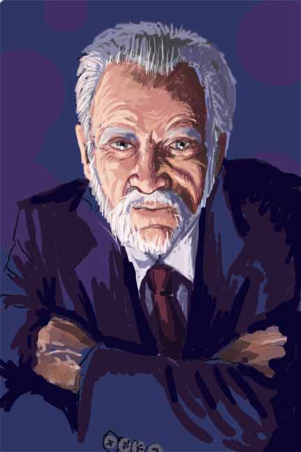
I started this series called "Weird Mediums" as I learned of a couple of artists doing some very unique and entertaining art that I wanted to share with others. I've previously done two posts HERE and HERE . Below are some of my more recent discoveries I'm sure you'll enjoy.
His personal website http://www.theportraitart.com/about.html


The first book carver I ever heard of was Brian dettmer. He uses old books as his medium and carefully carves images and sculptures into the books in great detail and precision. You can view a ton of his work on his website at http://briandettmer.com/
For some other weird uses for books check out this website which shows books used to make a building, a chair, a kindle case etc.http://www.neatorama.com/2011/04/27/cool-non-literary-uses-for-books/
I first learned about this next fellow through his video in which he paints on a black board with glue and then throws dirt against that in the end to reveal the image. Kind of reminds me of those sand art images I used to do as a kid. Michael Raivard also does various other kinds of performance painting with great flare and energy. Fun to watch!
This next one is also quite fascinating to watch and has an a stounding result. This artist drops paint into water to create water paintings, a process called “ebru”, and then captures the final image on paper. Unfortunately I can’t figure out who the artist is but here’s a video of him at work on YouTube.

I found him entertaining to listen to. http://www.ted.com/talks/lang/eng/vik_muniz_makes_art_with_wire_sugar.html
This next one I’m not sure qualifies for weird mediums as it’s fairly typical to use found objects in sculpture but none the less I loved his work and it certainly is weird! So here’s a video of some of Daniel Proulx’s steam punk jewelry.
Subscribe to:
Posts (Atom)