I've been busy with a lot of different projects lately but was happy to be able to work in some time for an ala prima landscape painting this past week. It's the first acrylic painting I've done in a looong time but I tried to paint it like I would an oil, trying to lose the edges in some areas and having lots of colors worked into each section. The painting is now available on my etsy store.
https://www.etsy.com/listing/186935865/original-east-burke-vermont-burke?ref=shop_home_active_1
Showing posts with label landscape paintings. Show all posts
Monday, April 21, 2014
Wednesday, February 26, 2014
Vermont Landscape Oil Painting Posters and Pillows Available
Yesterday I posted links to canvas prints that are now available of my two large Vermont landscape paintings. I've had lots of people show interest in these images but many don't have the extra cash for a canvas print or an original piece of art. So I now have poster prints available at a much more affordable price of about $20 for posters that are roughly 30"x 15".
http://www.zazzle.com/willoughby_lake_from_burke_mountain_poster-228449868142840144?rf=238344308620390165
http://www.zazzle.com/willoughby_lake_westmore_vermont_oil_painting_poster-228883102036149465?rf=238344308620390165
I also tried a product for fun and actually ended up liking it quit a bit. I put both paintings on a double sided pillow.
http://www.zazzle.com/double_landscape_pillow_front_and_back_designs-189445286317668791?rf=238344308620390165
Tuesday, February 25, 2014
Canvas Prints of my new Original Landscapes
Over the past seven months I painted two new large landscape paintings. As of today those paintings are now available to purchase as high quality canvas prints in my online store. The original art isn't yet ready for purchase but will likely be available sometime soon. The links are below.
http://www.zazzle.com/willoughby_lake_from_burke_mountain_canvas_print-192531746874324310?rf=238344308620390165
http://www.zazzle.com/willoughby_lake_westmore_vermont_oil_painting_canvas-192140012953529503?rf=238344308620390165
http://www.zazzle.com/willoughby_lake_from_burke_mountain_canvas_print-192531746874324310?rf=238344308620390165
http://www.zazzle.com/willoughby_lake_westmore_vermont_oil_painting_canvas-192140012953529503?rf=238344308620390165
Monday, February 17, 2014
Wine and Art Snowcase
I don't get a chance to do a lot in terms of meeting the public with my art much these days so when I do it's all the better. This past weekend I was at a local show with my landscapes and decided to bring some of my books along as well. As usual with these events, I didn't make a bunch of sales but I did meet a couple of people who may hire me for small gigs down the road. I also had the opportunity to talk with many of the other artists and got some great tips and advice. In particular I was happy that I'm finally starting to figure out a setup that isn't extremely hard to put together and looks pretty good compared to past events.
Labels:
children's book,
landscape paintings,
self promotion
Tuesday, August 27, 2013
Vermont Oil and Watercolor Landscape Paintings
Each year I wait alllll through the winter to finally have a chance to go out and do some ala prima landscape paintings in the summer. The same was true of this year but unfortunately I never found a chance so far this summer to go out in the field and paint on location. A few weeks back i did finally take a bit of time to do a quick watercolor on location.
Then finally over the past couple of weeks i carved out some time from my current children's book to do a couple of oil landscape paintings of local vermont scenes. Both are done from photos though. The first is a barn in lyndonville vermont.
I will have them for sale pretty much as soon as they dry and i can get a frame on them. I'm not yet sure where i will have them for sale but considering local shops or the hospital, which displays local artists on their walls. This second one is from the top of Burke Mountain in East Burke Vermont looking out over Willoughby Gap and Willoughby Lake in Westmore Vermont. I've hiked Mnt. Hor, Mnt. Pisca and Blad Mnt. all visible in this image.
Then finally over the past couple of weeks i carved out some time from my current children's book to do a couple of oil landscape paintings of local vermont scenes. Both are done from photos though. The first is a barn in lyndonville vermont.
I will have them for sale pretty much as soon as they dry and i can get a frame on them. I'm not yet sure where i will have them for sale but considering local shops or the hospital, which displays local artists on their walls. This second one is from the top of Burke Mountain in East Burke Vermont looking out over Willoughby Gap and Willoughby Lake in Westmore Vermont. I've hiked Mnt. Hor, Mnt. Pisca and Blad Mnt. all visible in this image.
Labels:
landscape paintings,
nature,
oil,
vermont,
watercolor
Monday, May 20, 2013
Maple Tree Watercolor Painting Kirby Vermont
This past weekend I finally had the opportunity to get my watercolors out for my first ala prima landscape painting of the season! I have to give credit for the inspiration and idea for this piece to my wife.
I'll likely eventually post this for sale on my etsy store but for now I'm going to get a few more paintings done first so i can photograph them and post them all at the same time. I currently have seventeen items posted to my etsy store, various landscape originals and prints.
A little bit of the process work.
Labels:
landscape paintings,
nature,
process,
watercolor
Thursday, December 13, 2012
Imaginative Family Portraits
The last few months have challenged me with a few opportunities to create portrait work. This is something I decided a couple months back that I would like to consider pursuing in a bit more depth. While portraits have never been my specialty and while I do struggle with them I think I found a couple of niches that work for me and give great results for the client and that I enjoy doing. One of those styles is the new style I'm calling "Imaginative Family Portraits". When I told a friend about this he asked me if I was painting an imaginary family for a guy who doesn't actually have a family.
What it actually is is to use various pictures of a family as photo reference and sort of collage them together if needed to get the best qualities from each photo. Then the really imaginative part is in the background or in how we chose to portray those figures. In doing this we end up with various photo references with various lighting situations so I basically have to imagine the light on their faces and often find other photo references to draw the folds on the clothing and such. It's a far cry from having the family sit in front of me to paint or just using one photo to copy meticulously. In the end it's not a traditional sort of portraiture at all but serves as an interesting conversation piece that hopefully at least captures their likenesses. For this particular image we went through a number of ideas and decided on showing his family snuggled into a background displaying the various family vacations they had been on.
We also worked in various other interesting tid bits from the family personalities like colleges they attended, the restaurant the parents went on their first date at etc.
I would be interested in doing more of this sort of project for the right price. I've done four of these so far and each of them has fallen between 100-200 hrs. from start to finish! So they aren't cheap but could be just the thing for anyone looking for a memorable gift you can't get just anywhere. Feel free to contact me for a quote or inquiries, matthew.gauvin@gmail.com Another style of portraiture I've been experimenting is similar to caricature. I'll show some pics for that image in another post tomorrow.
Tuesday, September 25, 2012
Dog Portrait, Characature, Landscapes etc.
These past few months have taken my art in unexpected directions as I venture into areas I hadn't given much consideration to previously. I'm currently working on a new family portrait image which I don't yet have samples of. It's another one of my "imaginative Portraits" that I began doing a few years back. The difference with this one being that it focuses more heavily on the portrait aspect than the previous two images did.
I also recently agreed to do a straight forward family portrait for a friend of my fiance. This came about as a result of him having seen the wedding invitations I illustrated for my upcoming wedding. I don't think I've ever done caricatures before either but for some reason this seemed like the natural thing to do for my wedding invitations. Not sure how that happened but they were tons of fun to illustrate and everyone is saying they love them!
I have also been putting a lot of work into making a portfolio of landscape paintings for the East Burke Fall Foliage Festival coming up on Sept. 29th in East Burke, VT. I've done landscapes in the past but never to the extent that I'm currently doing. I'm hoping to write a blog post this week displaying many of the images I painted for that. I'll have postcards and prints as well as the original art for sale.
Just today I finished painting a quick pet portrait I did as a reward for a kickstarter campaign for one of my books.
I've also been talking with a friend about doing a hand painted sign for his business. You might think that all of this is a result of not being able to find my typical children's book work. Actually I haven't really had an issue with that yet. I think it has more to do with just needing a bit of a break from those longer projects. All of these other avenues have been making me ask the question though. Should I in fact offer some of these other forms of art as a service? or should I stay focused in one area of art and try to perfect my skills therein? I don't know if it would make sense for me to have a children's book project going in one corner, pet portraits in one, landscapes in another and hand painted signs in yet another. In fact I know that would be a disaster and not good for my sanity as I currently have the messiest studio of all time and have nine folders for different clients on my desktop. I welcome any advice or comments from other artists who may have experience with these sorts of things in their own practice. I do have a feeling I'll keep doing some of these random projects on the side but will probably keep with the children's art as my main thing.
I also recently agreed to do a straight forward family portrait for a friend of my fiance. This came about as a result of him having seen the wedding invitations I illustrated for my upcoming wedding. I don't think I've ever done caricatures before either but for some reason this seemed like the natural thing to do for my wedding invitations. Not sure how that happened but they were tons of fun to illustrate and everyone is saying they love them!
I have also been putting a lot of work into making a portfolio of landscape paintings for the East Burke Fall Foliage Festival coming up on Sept. 29th in East Burke, VT. I've done landscapes in the past but never to the extent that I'm currently doing. I'm hoping to write a blog post this week displaying many of the images I painted for that. I'll have postcards and prints as well as the original art for sale.
I've also been talking with a friend about doing a hand painted sign for his business. You might think that all of this is a result of not being able to find my typical children's book work. Actually I haven't really had an issue with that yet. I think it has more to do with just needing a bit of a break from those longer projects. All of these other avenues have been making me ask the question though. Should I in fact offer some of these other forms of art as a service? or should I stay focused in one area of art and try to perfect my skills therein? I don't know if it would make sense for me to have a children's book project going in one corner, pet portraits in one, landscapes in another and hand painted signs in yet another. In fact I know that would be a disaster and not good for my sanity as I currently have the messiest studio of all time and have nine folders for different clients on my desktop. I welcome any advice or comments from other artists who may have experience with these sorts of things in their own practice. I do have a feeling I'll keep doing some of these random projects on the side but will probably keep with the children's art as my main thing.
Labels:
animals,
characature,
landscape paintings,
watercolor
Monday, August 6, 2012
Vermont Oil Landscape Paintings: 2
Back in April of 2011 I posted a bunch of oil landscape paintings I did over the past few years. I've since sold most of those paintings but haven't had time to make more until now. I've been working on tons of small watercolor landscapes and this past Saturday I painted the first oil landscape that I've done in over a year. I decided to document the process a bit.
posts of my watercolor landscapes. first few , shows my pocharde box for plein air watercolor painting
This first image shows the final painting. Oil on 5"x6" wooden panel. I actually already painted this same scene twice in watercolor but have changed things with each image. the first one has a house int he background with hay bails in the field on the right and the corn had just begun to grow. The second image put a differetn house int he image and has corn growing more but focusus more ont eh patern of the various fields. Then for this image I intended to focus primarily ont eh foreground corn. Unfortunately I ran low on time and ended up rushign the corm more than intended.
posts of my watercolor landscapes. first few , shows my pocharde box for plein air watercolor painting
This first image shows the final painting. Oil on 5"x6" wooden panel. I actually already painted this same scene twice in watercolor but have changed things with each image. the first one has a house int he background with hay bails in the field on the right and the corn had just begun to grow. The second image put a differetn house int he image and has corn growing more but focusus more ont eh patern of the various fields. Then for this image I intended to focus primarily ont eh foreground corn. Unfortunately I ran low on time and ended up rushign the corm more than intended.
This next image shows the various items I bring with me when painting with oil in plein air. Some of these things are the same as used for my watercolor supplies. 1) fishing or picnic basket with hinge top. 2) orderless Mineral Spirits in a pickle jar to clean the brushes. 3) oil paint tubes. I tied to limit my pallet to make color choices much faster and for an easier accomplished color harmony. Basically I have a warm and cool yellow, blue and red with white and a purple. 4) refined linseed oil for thinning the paint. 5) duct tape to hold things down. 6) a small folding canvas chair with a cold pouch built in under the seat. 7) This is a book I bring out into the field with me from time to time as I'm still learning how to get better and faster with my landscapes. "Oil Painter's Solution Book : Landscapes: Over 100 Answers to Your Oil Painting Questions" by Elizabeth Tolley. 8) A durable metal easel the adjusts up taller and shorter with tilting bar which accepts various size canvases. 9) A hand sewn brush pouch my sister made for me. It has various width slots to slide the brush handles into and has a flap that folds over the top of the brushes, then I roll it up to keep all of the bristles in shape during transport. In this pic I have folded the corners around the easel legs and clipped the corners of the brush pouch cloth in the back. 10) a mixture of OMS and linseed oil in a small glass jar with a tight lid for thinning paints. As I build up the layers I use less OMS and more linseed oil for thicker layers of paint that will take slightly longer to dry. Doing the reverse may lead to cracking paint. 11) this is the same wooden box I use for my watercolors. It has a hinging lid and various compartments in the bottom half. 12) paint rag. 13) wooden panel with gessoed surface. 14) my wooden paint pallet that I've had since college.
below is a pic showing the painting in process. 1) is a tiny quick thumbnail value study to help me remember the original value structure as the light changes a lot over the course of a few hours. 2) I put some duct tape from the top lid of the box to the bottom lid to keep it at a 90 degree angle. 3) I have a small piece of duct tape holding the panel to the wooden box lid. The wooden box is clamped onto the easel between the two clips made for holding canvas. You can see my pallet in the foreground with dabs of paint laid out. I generally hold it in my left hand or rest it on my lap.
Below is a series of pics I took during the painting process. The first step involves laying in basic value structure . This is very thinned down paint and generally helps the next layers of paint go down much faster. Sometimes I do the under painting with a warm raw sienna or ochre as I've read about many times but this time I decided to try something I read in Tolley's book which shows her painting the background values with a cooler under painting and the foreground with warmer tones. Doing this step also helps me to keep value in mind as I paint the various pieces of landscape. From reading Brad Teare's blog I learned a lot about keeping track of values from one mass to the next. Typically the sky will be the lightest value in the whole image, the ground or things on the horizontal plane facing the sky tend to be the next lightest while vertical things like trees and buildings have the darkest areas with the absolute darkest darks typically in the foreground. Typically i leave the sky white at this stage to allow more vibrancy to show through the sky. The darkest darks and highlights are saved for last
In this second image I have laid in the three or four main colors I mixed for the sky. I make a dark blue, light blue, a light yellow and light crimson. I start with dabs of each color, more blue and darker dabs towards the top and more of the warmer and lighter dabs towards the bottom of the sky. In step three I lightly blends the dabs of color together being sure to keep leave some of the colors showing rather than ruthlessly blend them. I learned this technique from a book by Wendon Blake called " The complete Painting Course"
The sky colors blended with a soft bristle brush. I use a flat brush but they say a filbert is best. I've never found a filbert that doesn't leave marks. Guess I haven't spent a enough money on them.
I've laid in a purplish undertone for the ridgeline trees then put a light blueish green for the highlights and tried to vary the colors slightly and focused on having an interesting ridgeline. I later went back in and put sky holes in the trees. Sky holes is when you can see sky through the foliage of the trees. I first learned about this from my highschool art teacher Larry Golden and have since learned it from James gurney, Wendon Blake, Brad teare and others. When I was first learning to paint with acrylics I used to paint the whole sky first and paint the tree and leaves on top but this method of painting the sky holes on top of the foliage I find to leave much more pleasant results. I'll probably write a whole blog post about it at some point.
Now I worked in the middle ground trees and continue with the foreground field trying to keep variation of color amongst the trees and have them slightly darker than the background while the foreground field was in fact slightly lighter than the background field. The final image shows the corn painted in. ( the first image show in this post.).
Labels:
how to,
landscape paintings,
nature,
process
Thursday, June 28, 2012
Pocharde Box for Plein Air Watercolor Painting
It's been a while since my last post as I realized this post will be my one hundreth POST!!!! I found it to be a bit intimidating to approach this post as I didn't want to just keep posting recent art. I've been wanting to find the time to post informational and interesting posts. There is sooo much I have learned over the years to make my process faster, easier, and just with making art in general that I would like to share with others. Unfortunately those kinds of posts take a lot more preparation and effort. One day I suppose I will get to some of my ideas for those.
For today I decided to show a bit of behind the scenes for my materials I take with me when doing plein air watercolor paintings. In the past I've done alla prima oil paintings which would be a completely different, heavier more complex set up than this. At some point I will likely do a post on that process. When painting in oil I plan on taking the whole day to hike out into a field and stay set up for atleast a few hours. The light changes a lot over that time, so sometimes I end up going back a few times if needed.
Above is a picture of all my supplies in the general setup I use while painting. In this case I was sitting on the ground so I used my larger wicker paint box which I believe was a fishing basket I picked up cheap at a yardsale.
For today I decided to show a bit of behind the scenes for my materials I take with me when doing plein air watercolor paintings. In the past I've done alla prima oil paintings which would be a completely different, heavier more complex set up than this. At some point I will likely do a post on that process. When painting in oil I plan on taking the whole day to hike out into a field and stay set up for atleast a few hours. The light changes a lot over that time, so sometimes I end up going back a few times if needed.
Above is a picture of all my supplies in the general setup I use while painting. In this case I was sitting on the ground so I used my larger wicker paint box which I believe was a fishing basket I picked up cheap at a yardsale.
Generally I paint while sitting on a tree stump, rock, or chair etc. in which case I tend to use the smaller paint box (#2) which sits on my lap. 3) sometimes I tape the paper to the back of a watercolor paper pad which can be proped up inside the wicker basket. Other times I tape the paper to the upper inside cover of the #2 box. 4) I generally bring extra water so I can have clean paint water whenever needed. 5) Is a small set of watercolors which has four little mixing areas in the lid and a convenient thumb bracket on the base. 6) I generally bring my camera as most of the watercolors I do are with the intention of possibly turning them into larger oil paintings later in the studio. Taking pics will help me to get extra information that may be needed for that process. 7) masking tape holds the paper down so it doesn't curl or buckle while painting. 8) a pencil sharpener. 9) pencil to sketch out the image before starting to paint. 10) I find that those little chicken bullion cube containers work great for holding the paint water and the lid seems to be water tight from my experience. 11) a variety of brushes and scrap paper to test colors. I forgot to number the additional paint pallet I sometimes bring with me, shown in the pic. I also generally bring sunglasses which help me to see values easier. It's also to have a viewfinder cut into a pice of card stock which helps to frame the image. Lastly you'lle need paper towels to clean bushes in between colors.
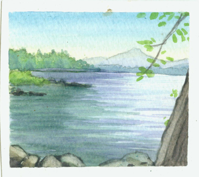
The resulting painting for this particular outing is shown above. For me the interesting elements to this scene were the lines and shape of the landscape. I also tried to capture the warmth of the morning sun. As I was painting, a woman was walking her dog and stopped by for a short chat with my fiance and her dog. She saw me painting and it wasn't until she left that I found out she was the owner of this particular house.
A few more watercolors I've done over the past couple of weeks. I do enjoy doing these, but I also find this medium to be a bit frustrating at times as some things just need more time to do properly with watercolor.These same paintings with oil would have been probably four times longer to do though.
Labels:
landscape paintings,
nature,
process,
watercolor
Monday, May 21, 2012
Watercolor Landscapes: North Hero Vermont
For more of my Vermont Landscapes got to : Oil Landscapes , Watercolor sketch
I spent the past weekend with my fiance at a friends camp in North hero Vermont, enjoying the summer. I found the time to squeeze in some small watercolor landscapes during my stay on the lake. I enjoyed it so much that I'm now considering spending a few days throughout the summer to make up a ton of these miniature landscapes all over vermont and make a zazzle store specially devoted to vermont postcards, calendars and the like. I still hope to work in atleast a few oil landscapes this summer to have in local businesses and will likely make that a priority, while doing these watercolor sketches when time is tight, perhaps some of them could become more finished oil paintings later.
Labels:
landscape paintings,
nature,
watercolor
Location:
North Hero, VT, USA
Friday, March 30, 2012
Cobblestone Magazine 2: Frederick law Olmsted
Yesterday I finally finished my second batch of illustrations for Cobblestone Magazine and they were approved!
This being a history magazine, each image comes with it's own hidden challenges and research not always evident on the surface. With this first image you might expect it was simple matter of going out to my back yard and taking a couple pictures of the trees and woods since I live in Vermont. While this image didn't require a ton of research for historical aspects it did take some time in the thumbnail sketch and developement stage. For one thing the boy needed to at least resemble his older self in the next couple of images. The hardest part for this was trying to design an image which shows the boy out in the woods while still leaving an area of smooth color for the text. I considered various options and finally envisioned this solution. I did do quit a bit of research for the following two images though and during that process I discovered that Olmsted helped design The back bay fens in Boston. I then remembered one of my favorite trees from that park when I lived in Boston. I still have pictures of it and did a finished drawing and painting of it for class assignments at Mass Art. So since this series is about Fredrick Law Olmsted I figured it would be the perfect Chance to paint this tree once again. I'm sure you can guess which tree it is.This next image was probably the toughest of the three simply because the topic didn't seem to have a whole lot of reference material readily available. My task was to portray Olmsted as an accountant/ Office aapprentice around 1840. I looked into the sort of clothing he would be wearing, I searched through a gazillion old office photos, I looked into the sorts of writing utensils in use, I even did some searching on what sorts of lighting and other office equipment might be visible in the piece. Again I had difficulty in designing this scene in which there was such a large chunk of text.
This final image required perhaps the most research while I suppose has less of that evident in the final image. My task was to illustrate Olmsted on his farm where he began to learn the art of landscape design. I researched the house and the land and had a look at various species of trees, clothing from the period etc. In the end I used artistic licence a great deal in the layout of the land as there was soo little to go on without actually visiting this property in NY. I would say the key element I did research for is the barn which the art director had me take out of the piece. I had a couple of books on hand about American barns and went to work reading about various styles and purposes. I read about how some barns in New England had roofs sloped at a good angle to allow the snow to stay on the roof and hence insulate the barn in the winter. I learned that painted barns start to appear in America in the late 1700's. Also that painted barns started in Virginia with gray toned paint while the more northerly barns moved in the direction of red. There are various theories for this. I find it interesting with Historical illustration how much behind the scenes research happens without ever being evident in the final pieces. There is a great deal of difference between illustrating the sentence, "The farmer worked on his farm" and the sentence " Frederick Law Olmsted worked on his farm in his early twenties". Overall I enjoyed my second round with the art director at Cobblestone and hope to eventually have time to work on another with them should they invite me back for a third course in history!
Labels:
history,
landscape paintings,
magazine illustration,
nature
Thursday, February 2, 2012
"A Cloudy Day" : Part Three
So this is a book I've been working on for the past four months or so. In my last post I expected to have the illustrations practically done in two more weeks. I sent the client all of the images as they were at that time. They all had skies colored as in the image below.
The client didn't like the skies. So I spent the past couple of weeks repainting the skies throughout the whole book. The color sample stage is designed specifically to avoid going through this sort of thing. But it doesn't always work that way.
Two weeks later and I do now have approval on the images so far. Lot's more to do but I can now see the end in sight. I've now started work on my next children's book "Pigs under the Post Office" and will soon be starting work on my second chapter book in the "Samantha" series with Daisy Griffin. YEah!!!!! I should also finally be finishing off the BBQ logo this month. With a bunch of other potential projects floating on the horizon.
The client didn't like the skies. So I spent the past couple of weeks repainting the skies throughout the whole book. The color sample stage is designed specifically to avoid going through this sort of thing. But it doesn't always work that way.

Two weeks later and I do now have approval on the images so far. Lot's more to do but I can now see the end in sight. I've now started work on my next children's book "Pigs under the Post Office" and will soon be starting work on my second chapter book in the "Samantha" series with Daisy Griffin. YEah!!!!! I should also finally be finishing off the BBQ logo this month. With a bunch of other potential projects floating on the horizon.
Saturday, January 14, 2012
"A Cloudy Day" book Illustrations in Progress
I typically don't enjoy showing in progress work unless I'm able to show the finished product along with it but today I just felt like making an exception. These are still far from being done and are mostly in the under painting stage. everything is still pretty dark right now as acrylics usually work from dark to light. An interesting fact for folks who live in this part of Vermont, the rolling hills in these images were inspired by Darling Hill Rd. I knew i wanted to give off the feeling that the characters are on a roller coaster ride to add fun to the story and Darling Hill Rd. gives that feeling perfectly. The last image actually features a particular mountain that I'm sure some will recognize when I show the final art. You might need to right click and chose to view in a separate window to see them a bit better. Not sure why blogger recently made it harder to enlarge images. 
Next week will be a huge leap from these rough under paintings to having 90% of the illustrations finished! Then probably one more week of doing fine detail work with the figures and faces.
As a reminder here's a shot of all the images in the final drawing stage.
I did some rough samples of the faces and the clouds too so the client would be able to get a feel for how those would be painted in the finals. Clients usually get a bit jumpy during the color sample and rough painting stage so it helps to have something a bit closer to a finished look for them to look at while waiting. the quarter and dime indicate the actual sizes I will be painting the original painted faces at. Luckily a few are much bigger to help add interest to the characters and really be able to see into their eyes. This story is just as much about the clouds as it is about the kids so we move the focus back and forth between them a bit.

Next week will be a huge leap from these rough under paintings to having 90% of the illustrations finished! Then probably one more week of doing fine detail work with the figures and faces.
As a reminder here's a shot of all the images in the final drawing stage.
I did some rough samples of the faces and the clouds too so the client would be able to get a feel for how those would be painted in the finals. Clients usually get a bit jumpy during the color sample and rough painting stage so it helps to have something a bit closer to a finished look for them to look at while waiting. the quarter and dime indicate the actual sizes I will be painting the original painted faces at. Luckily a few are much bigger to help add interest to the characters and really be able to see into their eyes. This story is just as much about the clouds as it is about the kids so we move the focus back and forth between them a bit.
Labels:
character design,
children's book,
color,
landscape paintings,
process
Monday, August 29, 2011
Watercolor Landscape: Calm before the Storm
There was plenty to be done in preparation for Hurricane Irene. In particular I was concerned simply because I had no idea what to expect, so I didn't know if I needed to put boards over my studio windows to protect my art, should I pick the rest of my tomatoes even though there are about thirty green ones? should I put sandbags at the base of the garage door to protect my fathers camaro that we just had brought up to this house?, or the 48 oldsmobile that has been sitting here for years? In the end I just picked up the larger objects in the yard and didn't worry too much about all the extra stuff. I did however find myself at the church helping the nights of Columbus cut down a bunch of brush and trees and tear down and old fence. There's nothing quit like a gathering of ten men with trucks, chainsaws, weedwhackers a heavy duty chain and an old wheathered fence. Whoever put those fence posts two and a half feet into the ground, to insure they wouldn't fall over, certainly didn't have us in mind as the ones who would be ripping them out!
Before all of the fun began, I found myself with an hour or so of quiet misty morning light in the church parking lot alone, as I had to drop my mom off to work early in the day. So I brought my watercolor sketching supplies along and did the image above. As this was one day before Hurricane Irene I'm calling it "The Calm Before the Storm". It was an interesting feeling to be working on such a calm scene a day before destruction and chaos was predicted to hit the area.
Labels:
landscape paintings,
musings,
sketching,
watercolor
Tuesday, April 19, 2011
Vermont Oil Landscape Paintings
I just realized I've never posted any of my landscape paintings to my blog. SO I guess now is as good a time as any since I finally got around to posting a few on my etsy shop for sale. http://www.etsy.com/shop/matthewgauvin?ref=si_shop and of course the snow is finally disapearing which means as soon as my current children's book is done I can get outside and do a few new lansdscapes!!!!
In particular I enjoy seeing landscapes done in thick oil paint. Over the past year I have learned a lot about this from Brad Teare on his blog titled "Thick Paint". Whenever I have time my hope is to delve deeper into thick paint with my landscapes while I'm headed more and more into watercolors and digital for my children's book art.
I really enjoy painting Landscapes as they give me the freedom to paint freely and make my own choices while getting me out of the studio for ala prima landscapes. Unfortunately that is something my children's book art is quit the opposite of most of the time. For children's books I do tons of thumbnails and idea sketches, search for tons of reference photos, consider borders and gutters and bleed and book sizes and text layout. Perhaps most importantly, I work with a client ,who generally has the last say in the final outcome as well as choosing between color choices, compositions and what goes in or stays out of each illustration.
In particular I enjoy seeing landscapes done in thick oil paint. Over the past year I have learned a lot about this from Brad Teare on his blog titled "Thick Paint". Whenever I have time my hope is to delve deeper into thick paint with my landscapes while I'm headed more and more into watercolors and digital for my children's book art.
Another artist who I would have to give credit to for helping me in my understanding of landscapes to some degree is Elizabeth Tolley. I picked up her book "Oil Painter's Solution Book : Landscapes" a couple years back and bring it out in the field with me. Excellent book on many levels!
Subscribe to:
Posts (Atom)