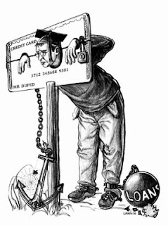
 Whenever I'm really stumped I tend to hang around until the ideas start flowing.
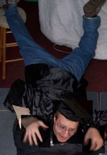
There are far too many sketches to post for all of the ideas and roughs to achieve this final sketch. Below is the final sketch with text laid in with photoshop.
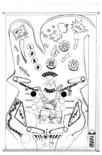 From here I did a few variations on the overall value relations throughout the image. I basically printed off a couple pages of the image and tried different renditions. I chose this sketch and adjusted the contrast in photoshop to get it darker.
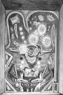
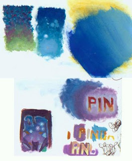
Then comes the color comps. Below are a few samples I did at about the size of a postage stamp. You can also see I tested the colors for the word "pinball" to see if I wanted the words lighter or darker than the background.
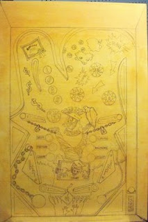
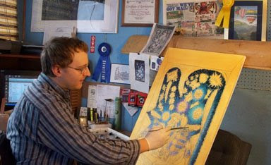
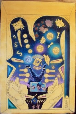
Next I tried a new technique I learned from combining the techniques of two amazing artists. From James Gurney I learned to protect the drawing on the canvas with spray fixitive which is later painted over with a thin coat of acrylic matte medium. This keeps the drawing from being pushed around by the oil paints and it gives a great surface for the oils. Next I laid in a transparent wash of paint in the complementary color of the finished painting. By nature oils are transparent, so the complementary color makes the finished painting pop even more. Dan Dos Santos does this but he paints in the lines of his underpainting rather than using pencil like I did.
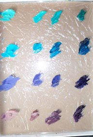
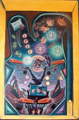
 Below is another new technique I tried. I premixed all the colors beforehand to ensure an overall color harmony throughout the painting. As you can see, I used blue as the dominant color with an overall cool color scheme. I also placed a midle value brown paper under a plexiglass pallete to help me see the values as I mixed paint.
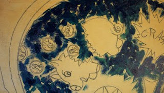
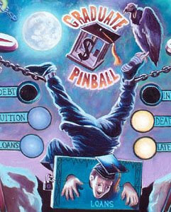
 The beginning brush strokes are laid in loose and playfull. I intermingled colors so the final result wouldn't be too flat. I learned this technique from Wendon Blake who does this when painting skies.

2 comments:
Very nice work, Matthew! Since I'm essentially a "representational" painter I can just "paint what I see". You, on the other hand, have to dream, imagine, envision and "invent" your final outcome.
That's a much tougher path to take and requires much more creativity.
My hat is off to you! Good job!
Wilson Bickford
Thanks Wilson! But I must say that painting what you see is much more difficult than people think. You know this of course, but I've only recently begun to study landscape painting and now realize how much work is involved. Your lansdscapes are more than just painting what's there. One example is your wave demonstration. WOW!
Post a Comment