I can't remember the last time I was aggravated enough with an illustration to completely scrap it and repaint from scratch, but with my current book I did that for two illustrations. The first was this "mud pies" image. there were many problems with the first image (orange/warm image on the right) so I went back to the drawing board and was much happier with the bluer version on the left. Took out the parking meter, better lighter spot for the text in the sky rather than over dark mud, darker mud, better color scheme, clearer details and less muddy colors overall.

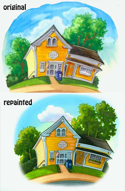
The next was this spot illustration of the post office. The client and I did like the first version but I'm pretty picky and saw lots of things that didn't come out as I had planned in my head. SO I tackled it again and like the new version much better. Mostly it was the trees, cloud and sky that made me want to repaint it but int the end I like all those as well as the new Po as well.


No comments:
Post a Comment